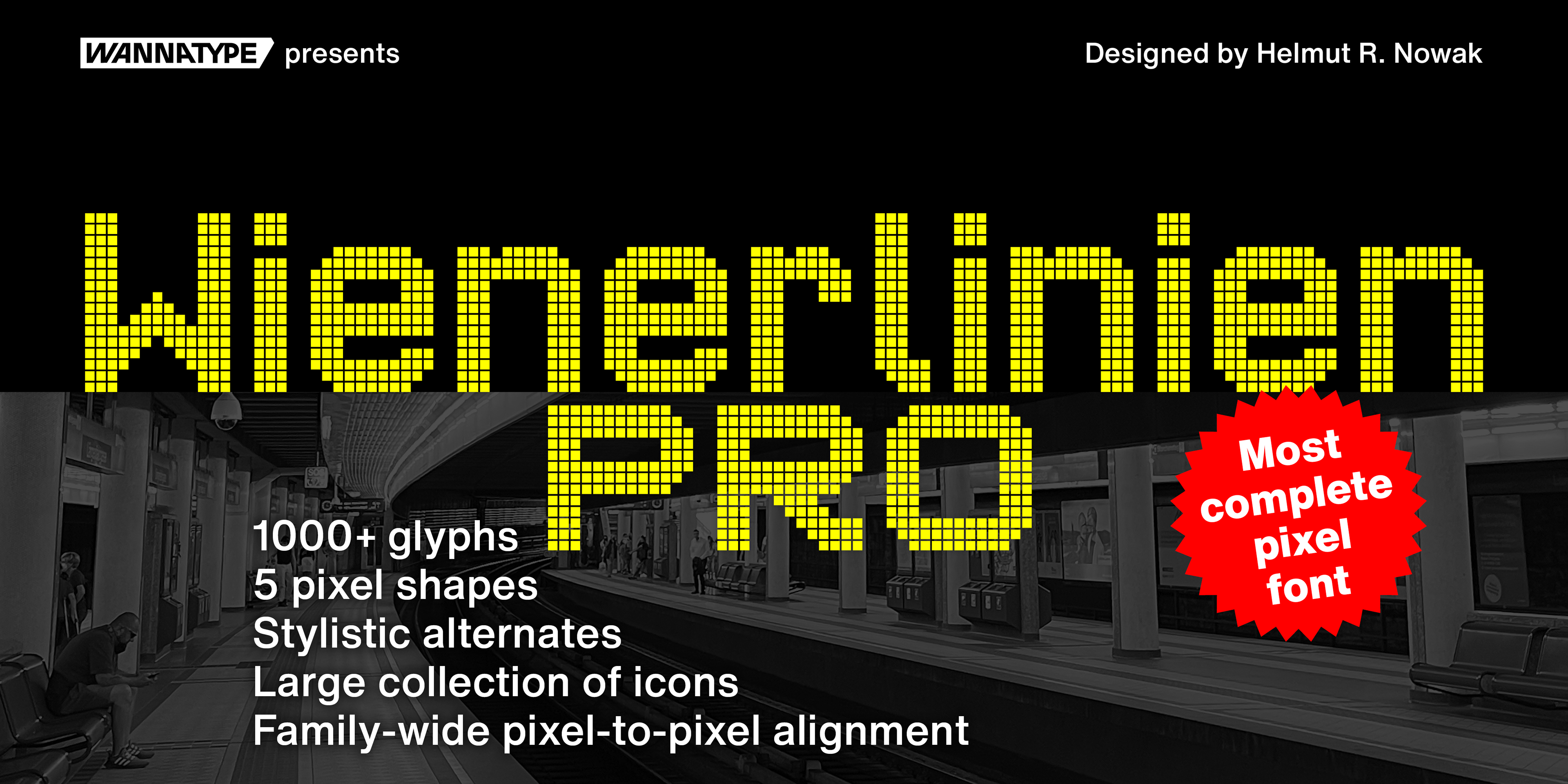
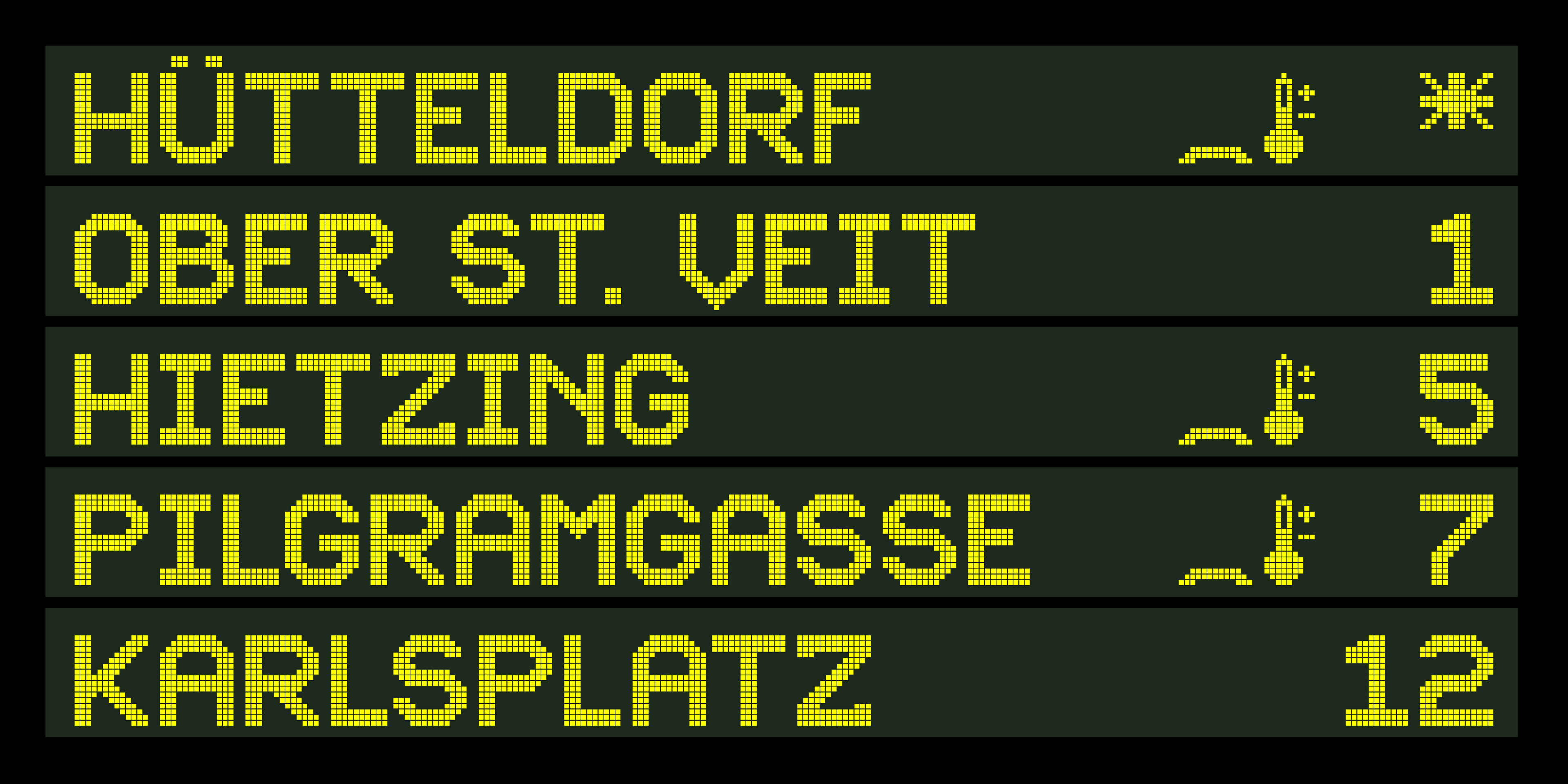
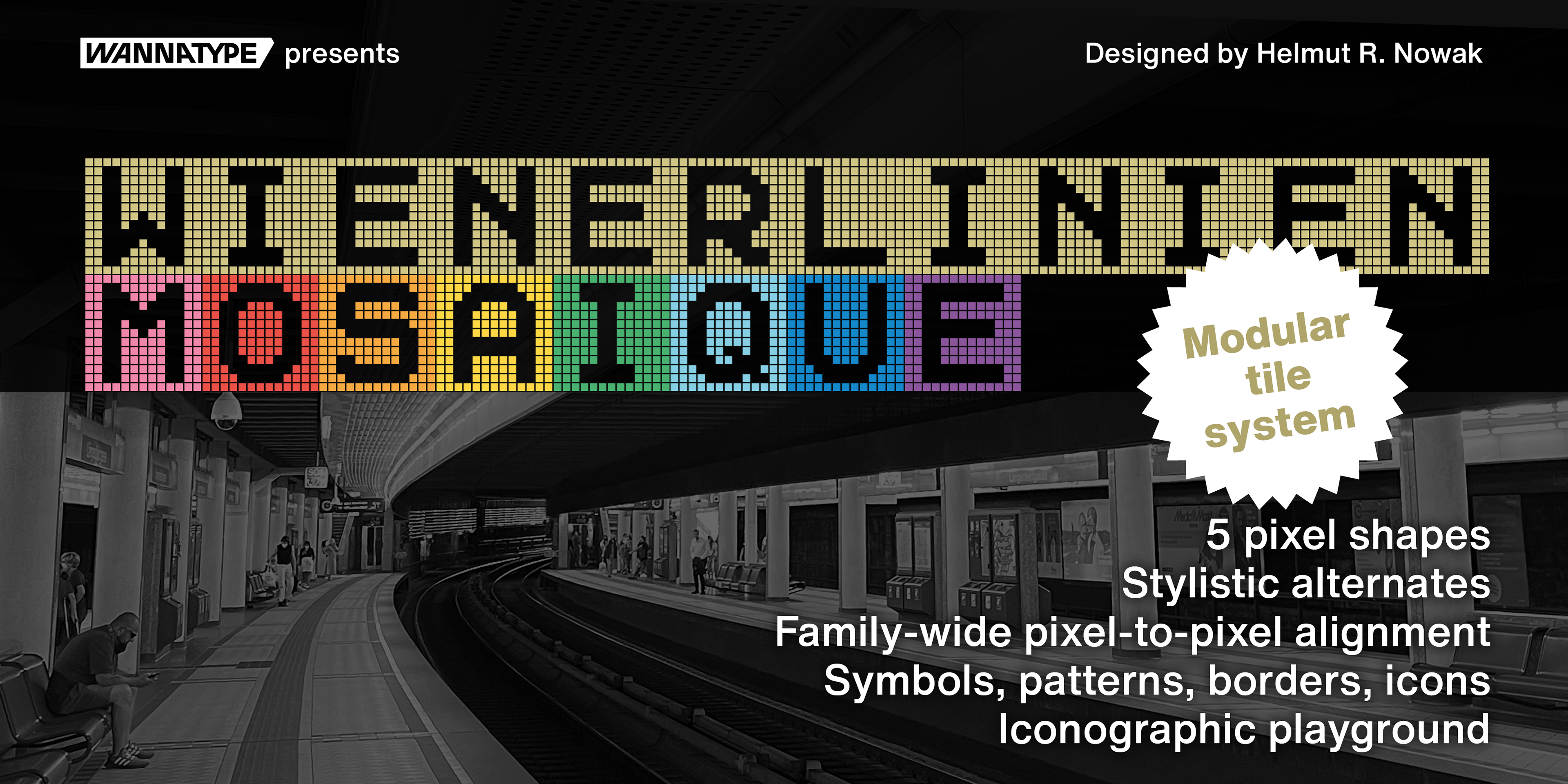
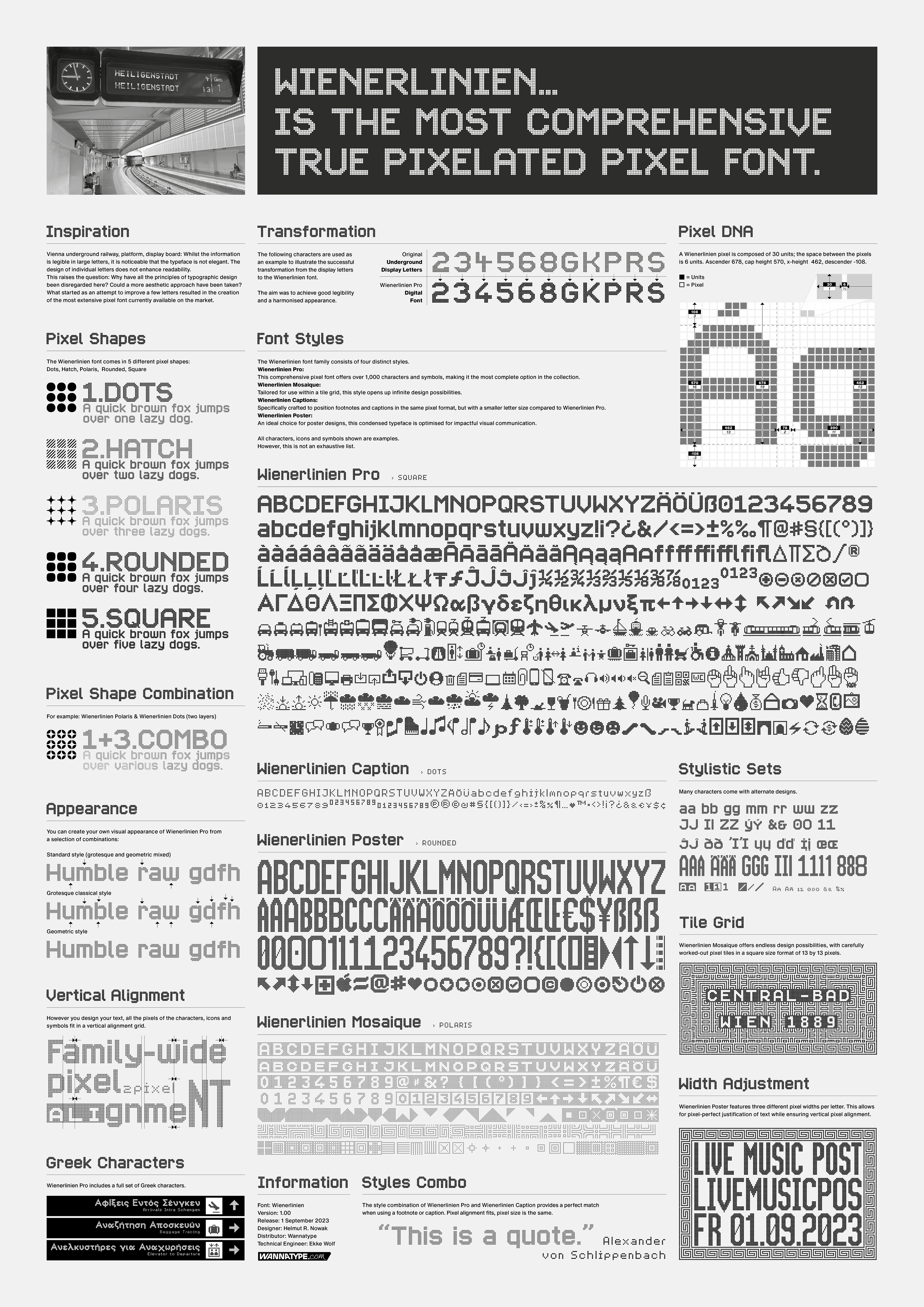
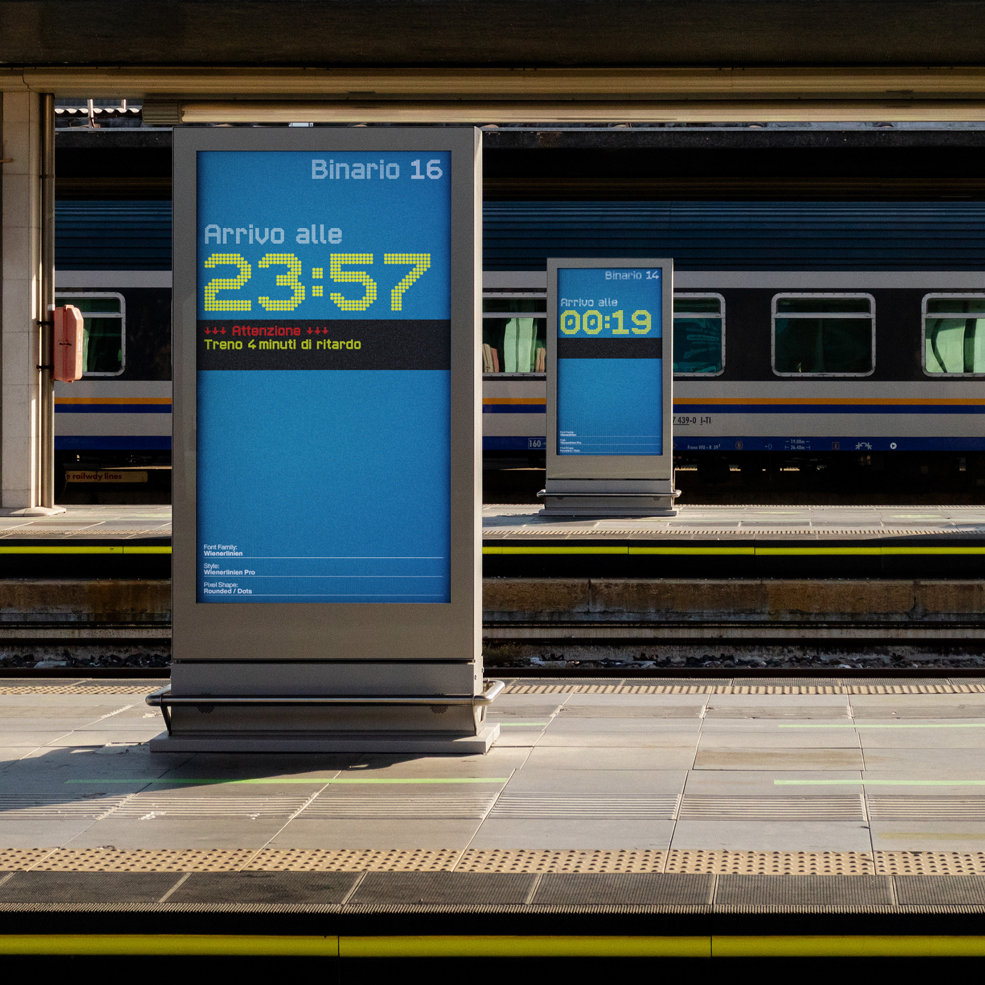
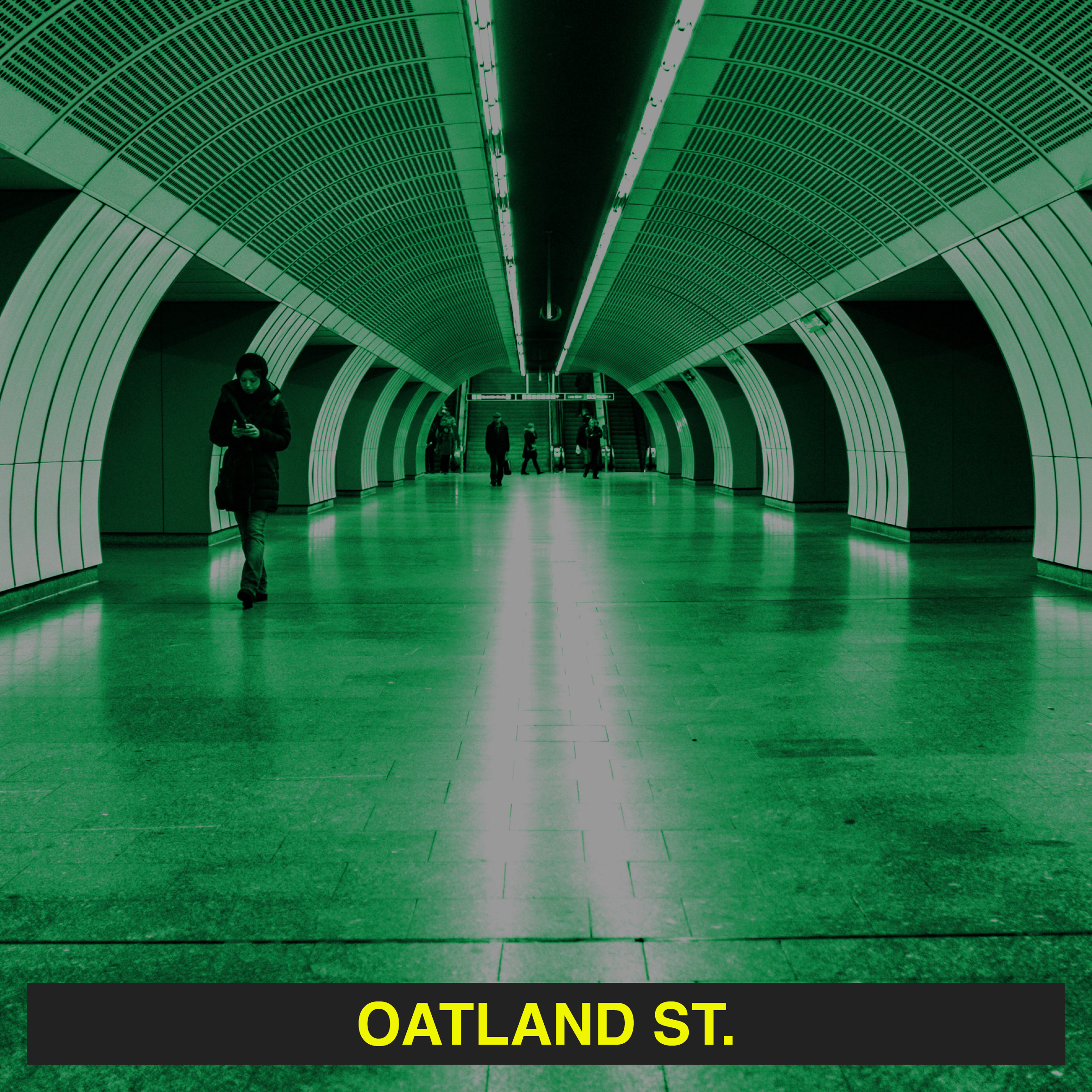
Since the pandemic, I have fallen in love with a new metier: pixel fonts. I was initially inspired by the bright yellow letters on the giant overhead signs of the Vienna subway. Some of these characters – seen by thousands of people every day – are quite ugly and inconsistent compared to the rest of the alphabet. I wondered why and reworked some characters. What started as a curiosity evolved into the competitive pixel font family Wiener Linien Pro. The font now consists of more than 1100 characters and is one of the most comprehensive and sophisticated pixel fonts.
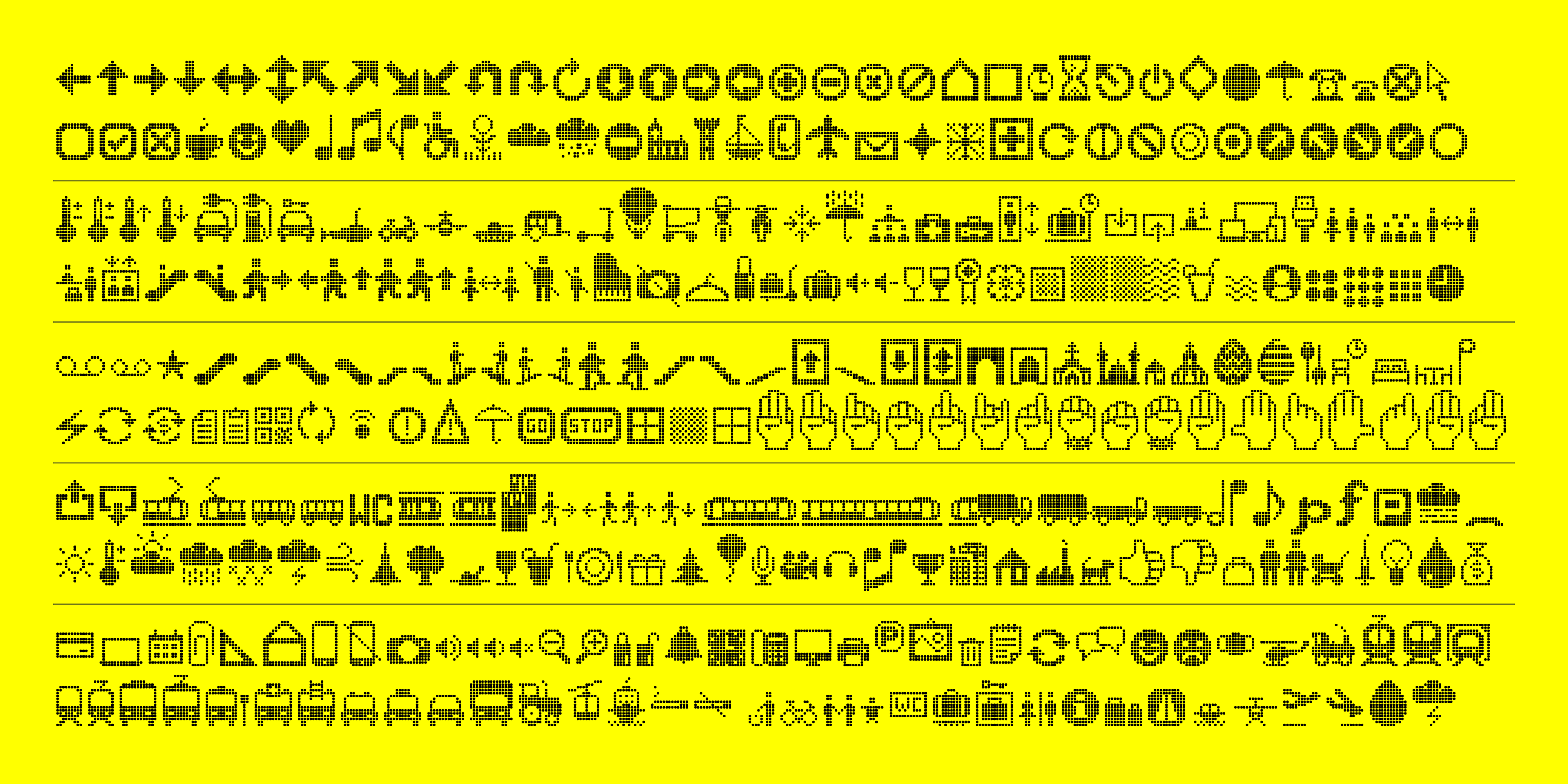
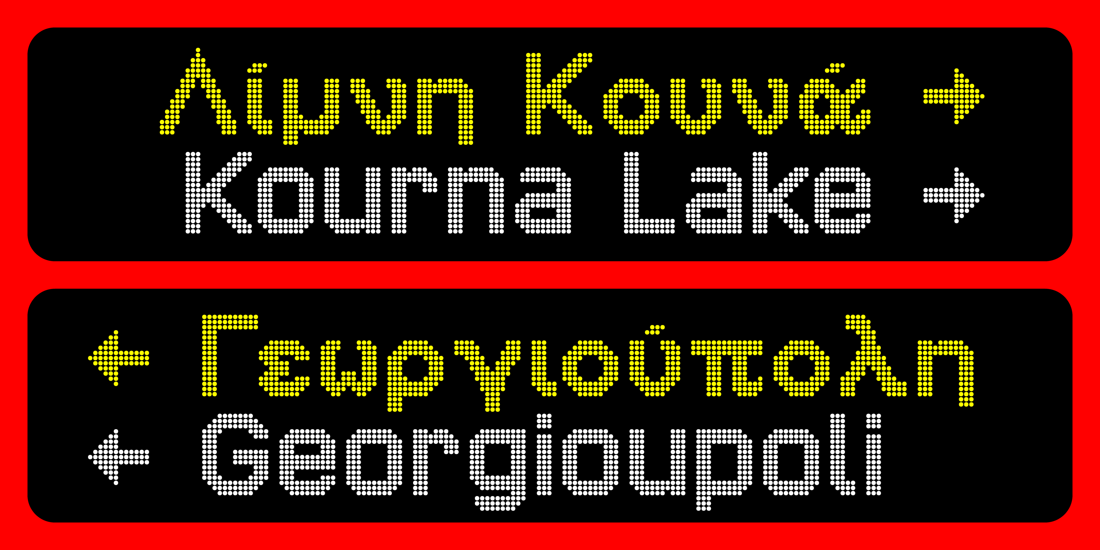
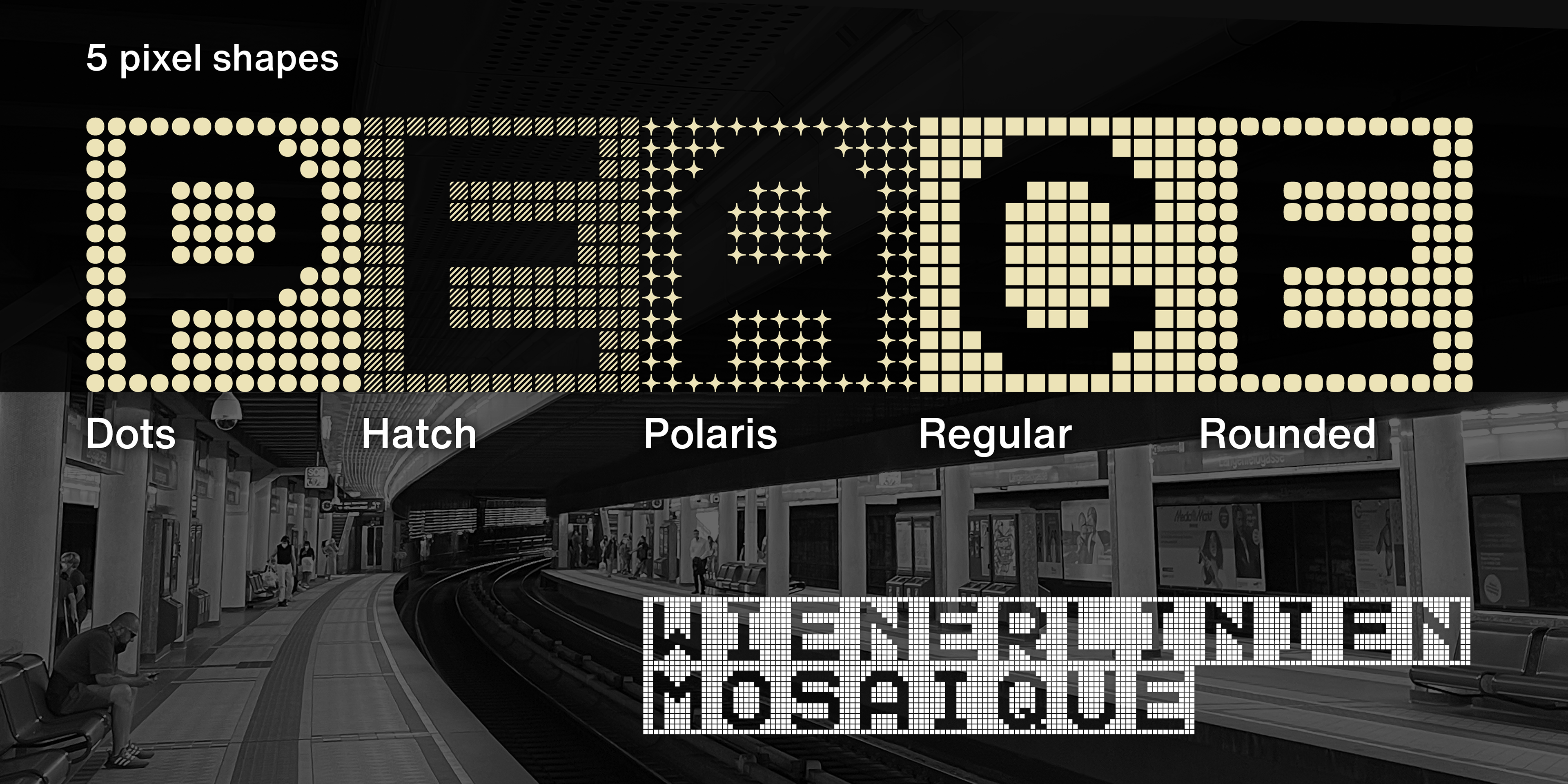
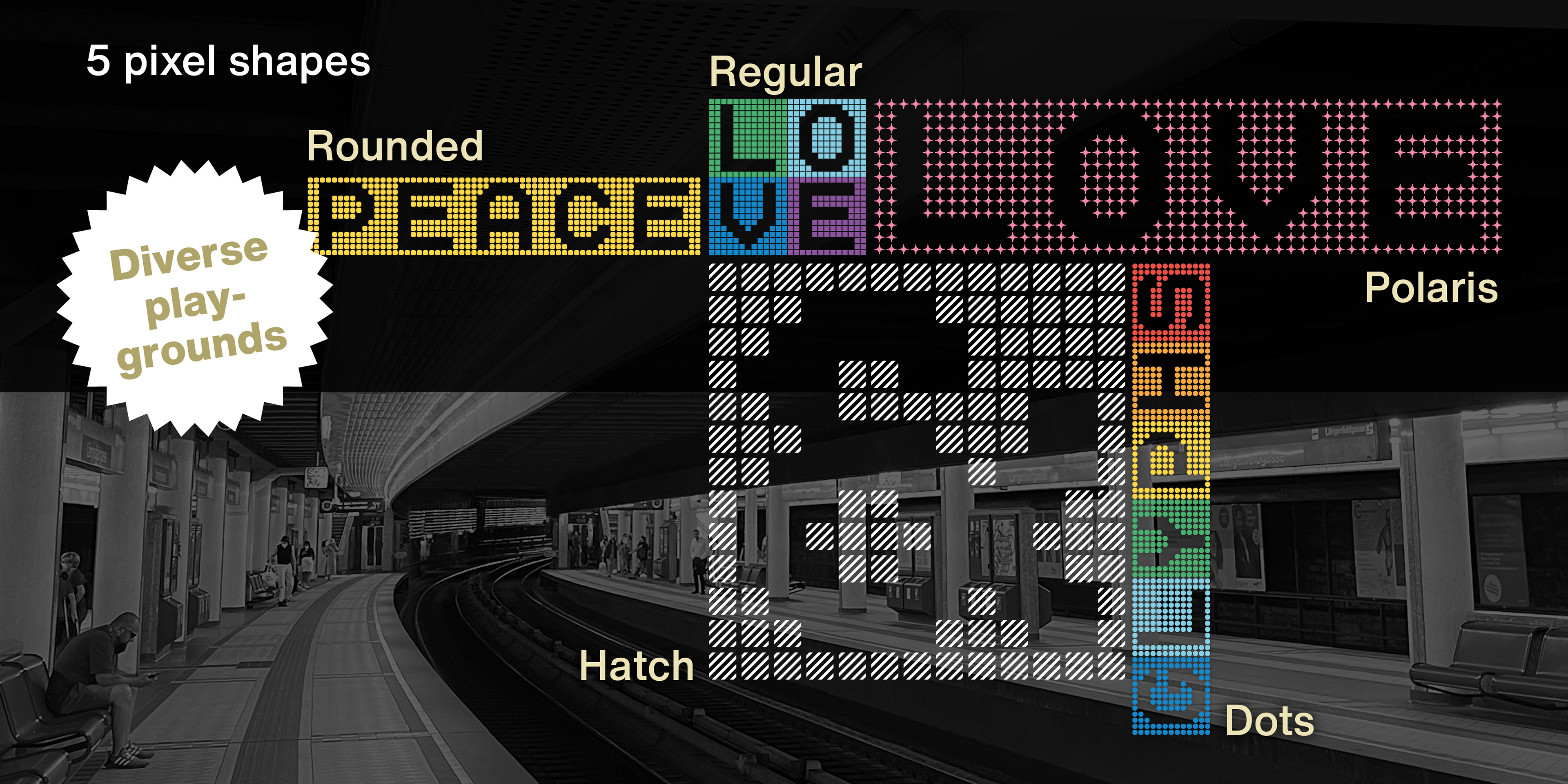
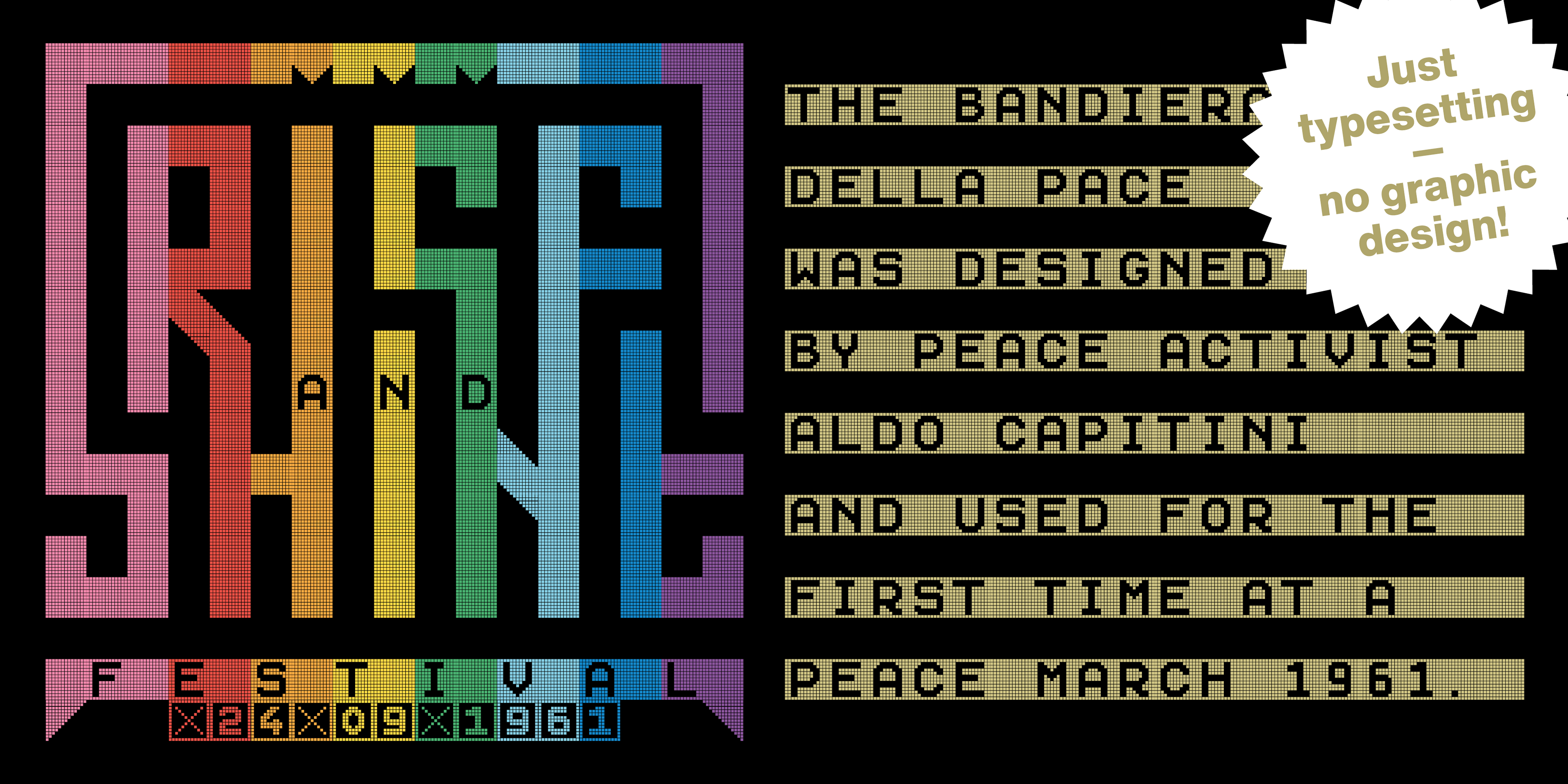
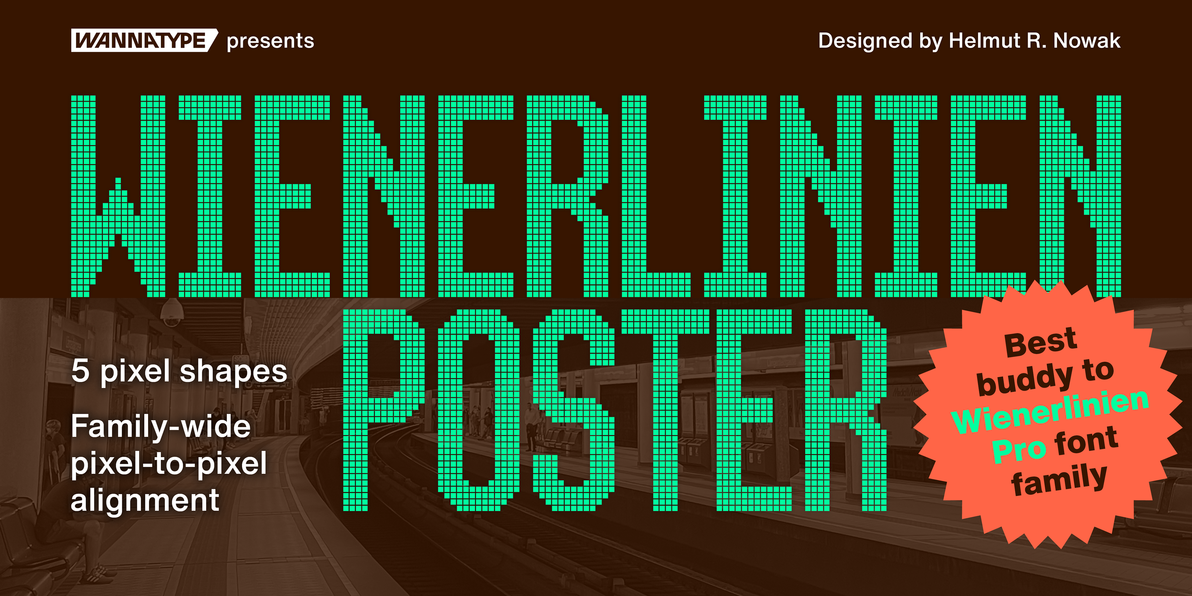
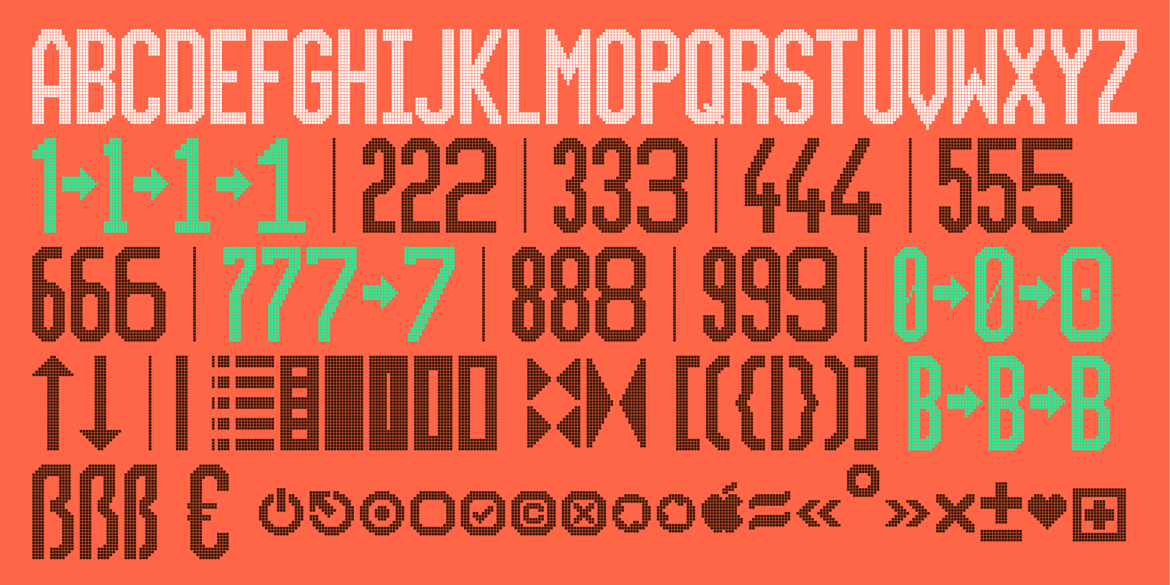
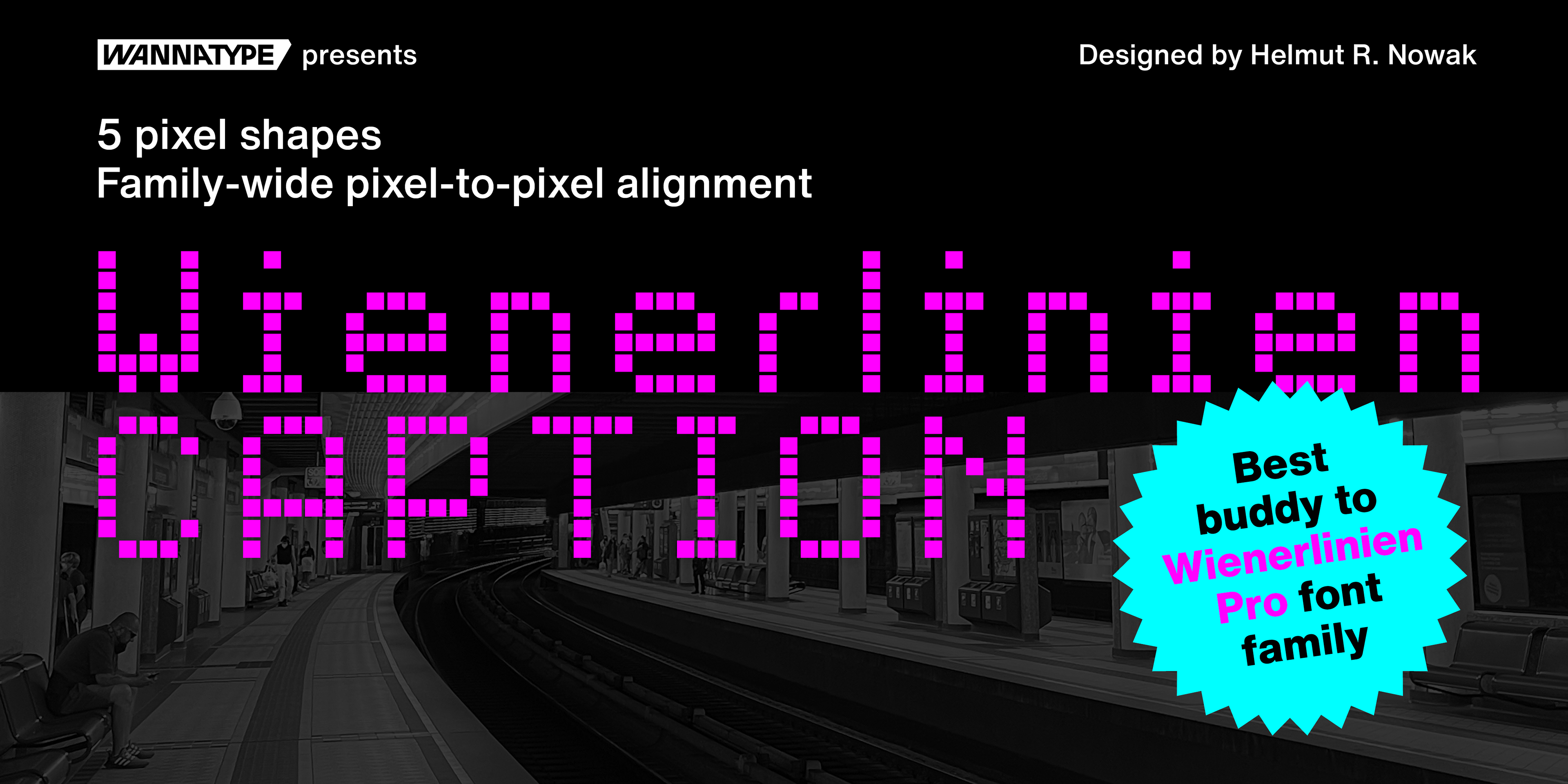
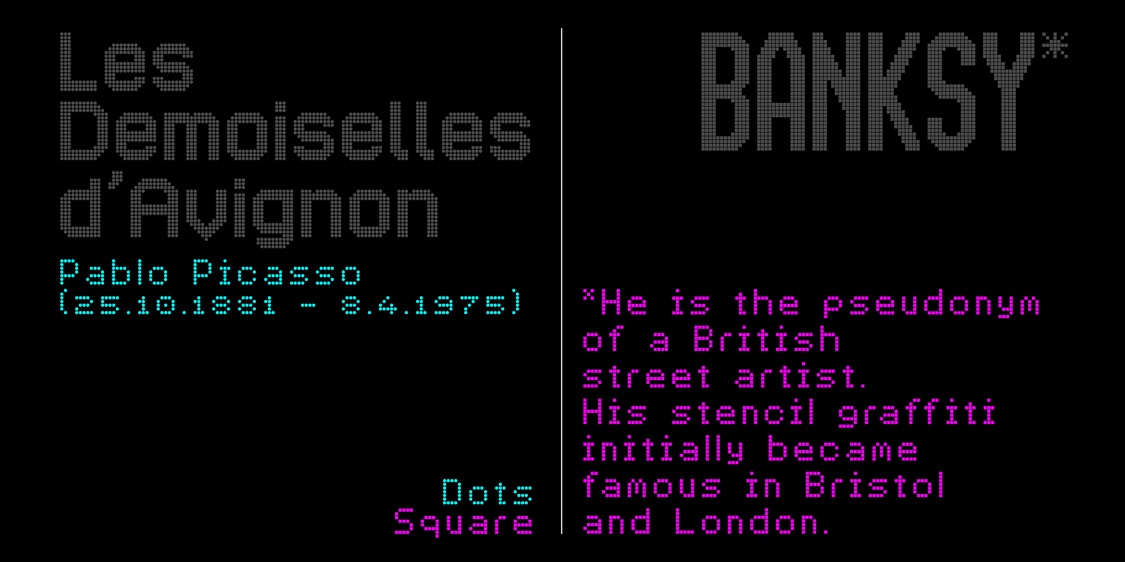
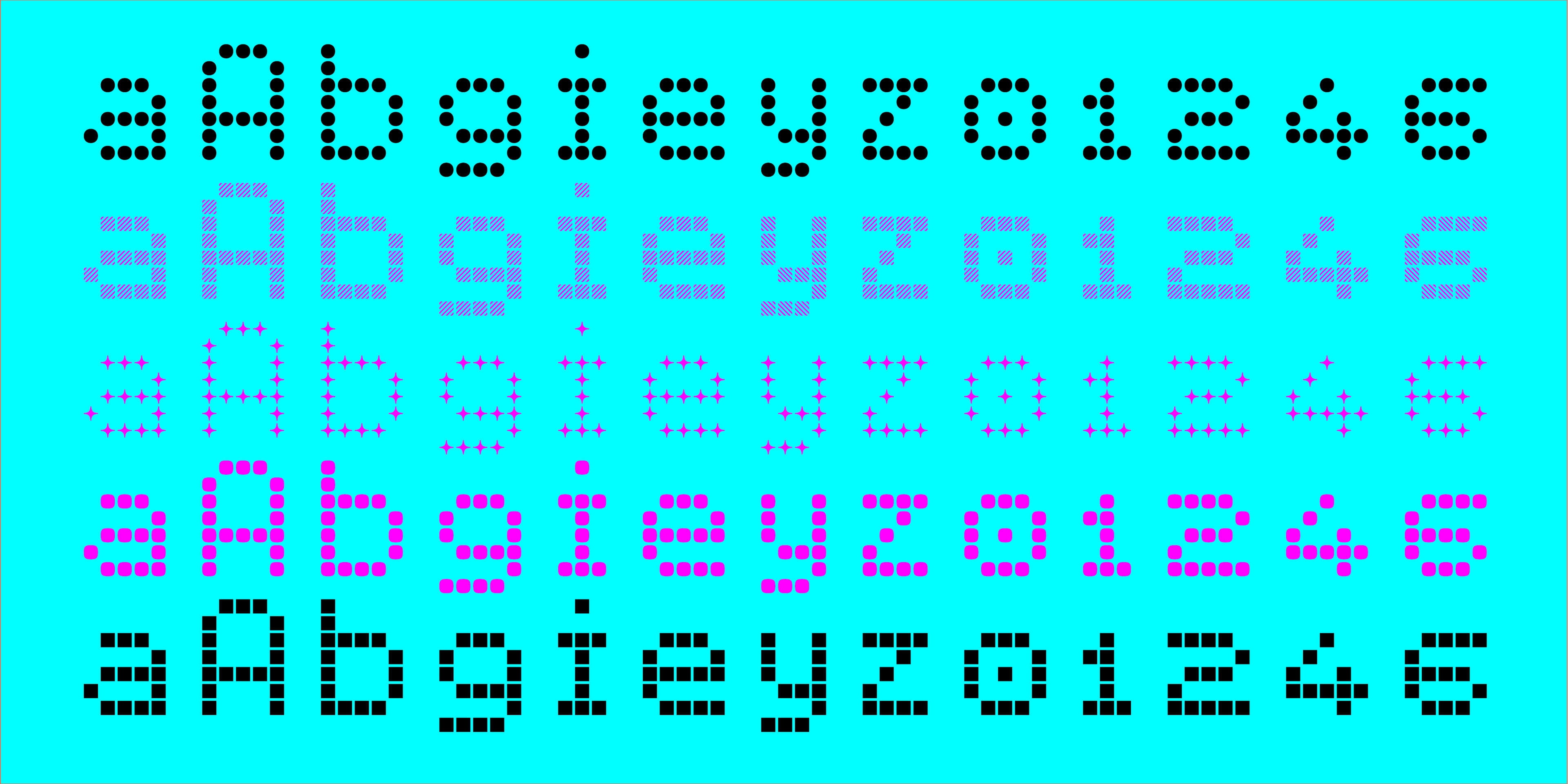
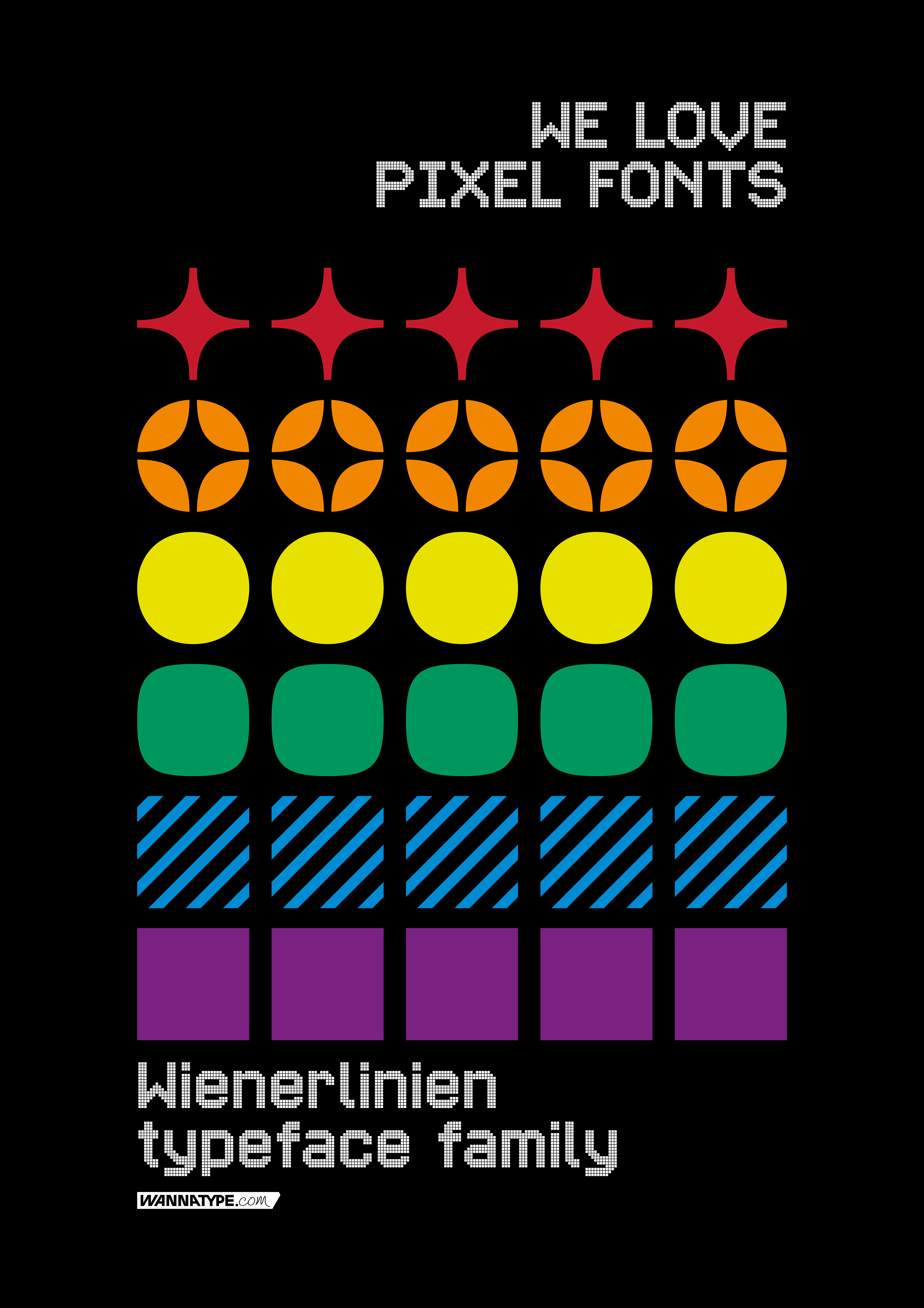
Wienerlinien Pro typeface was inspired by the bright yellow letters on the giant overhead signs of the Vienna subway. It’s a revised and refreshed version of the original characters and transformed into a timeless pixel font, easy to use in a digital environment. The font now consists of more than 900 characters and is one of the most comprehensive and sophisticated pixel fonts. The typeface has a special kerning: the individual pixels of each character are always exactly positioned on top of each other in each line. It includes multiple sets of numerals and many useful icons for public transport and beyond, as well as stylistic sets. Wienerlinien Poster is a compressed pixel font with 4 pixels stroke. It consists of uppercase letters and symbols. The font is especially suitable for poster design. Wienerlinien Mosaique consists of square tiles filled with pixels. You can create exciting mosaics and geometric shapes. Wienerlinien Captions is a font family constructed with as few pixels as possible. This set is perfect for marginal notes and crediting. Every design is available in five cuts: Dots, Hatch, Polaris, Rounded, Square.
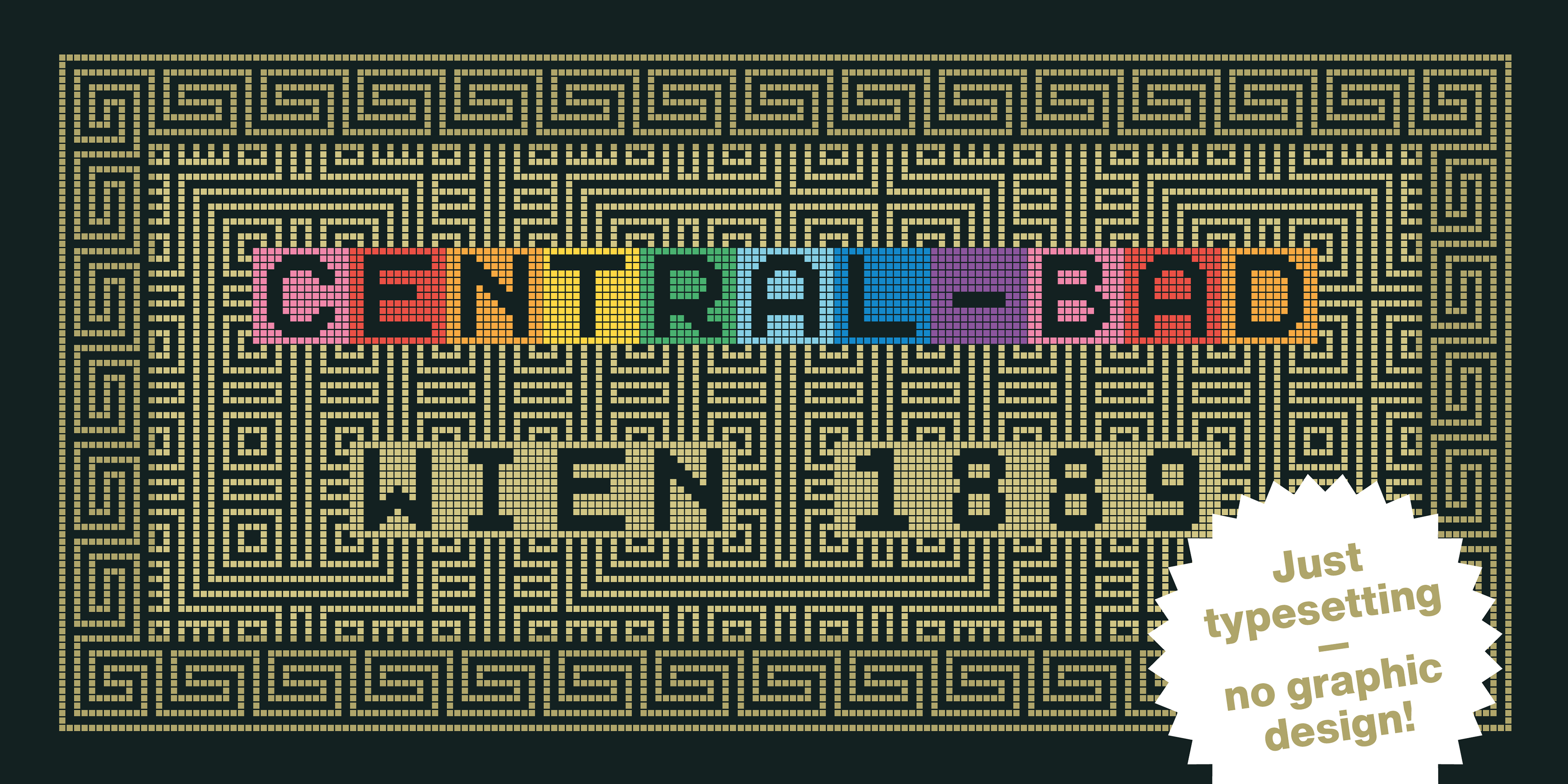
Font entrepreneurs, scroll down to discover in-depth details about the font and what makes it truly unique. Or better grab your licence at WANNATYPE FOUNDRY!
Font Creation, Editing & Programming
(2021 – 2023)
(2021 – 2023)