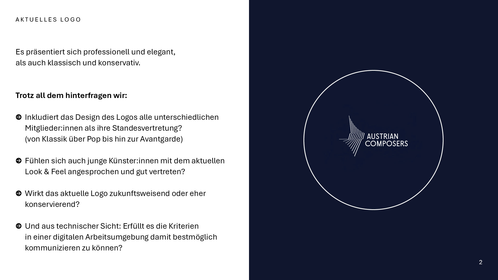
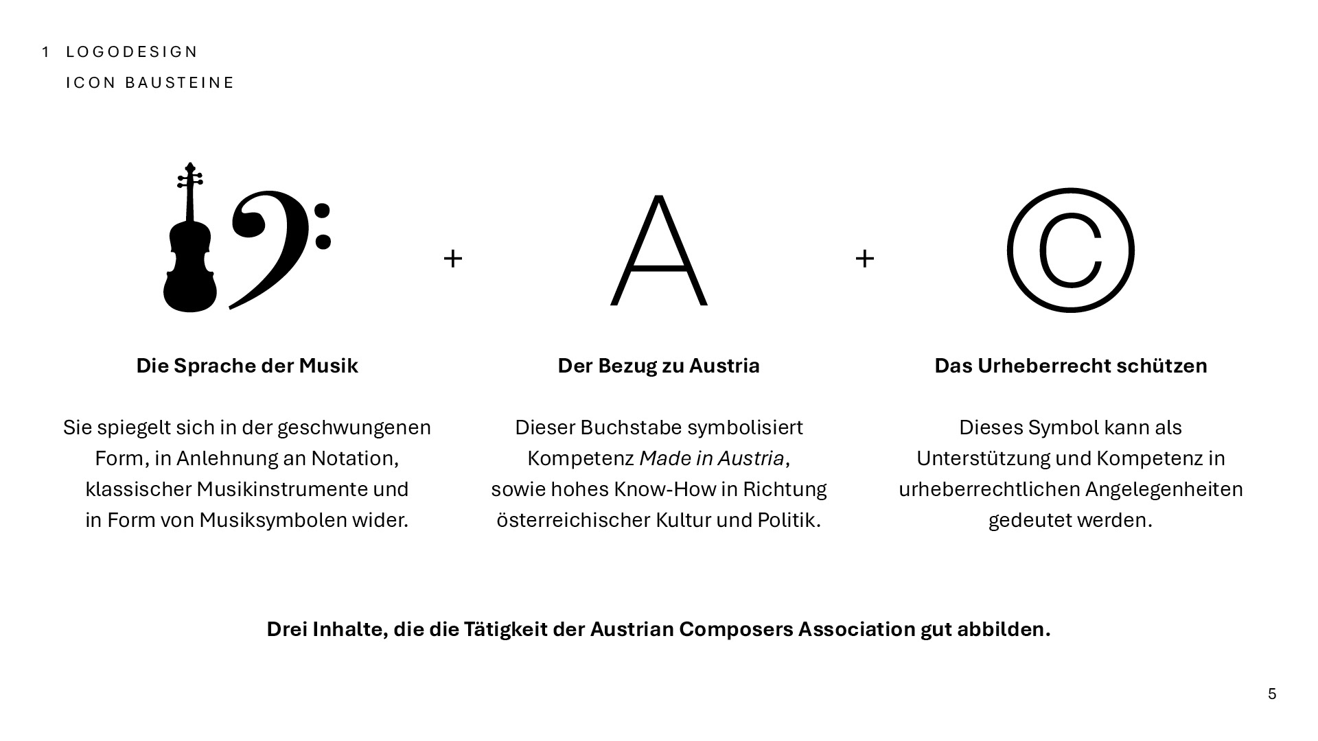
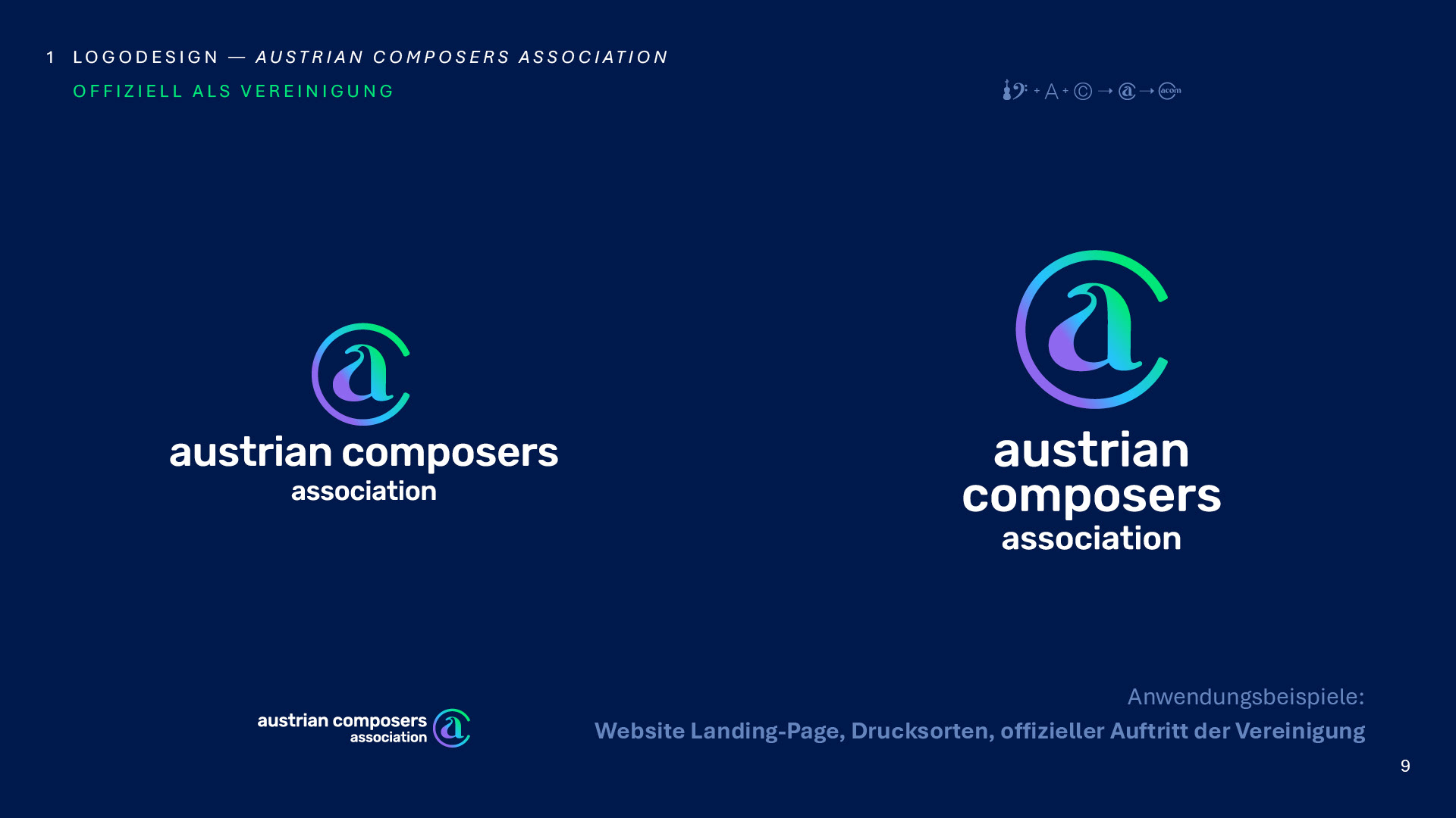
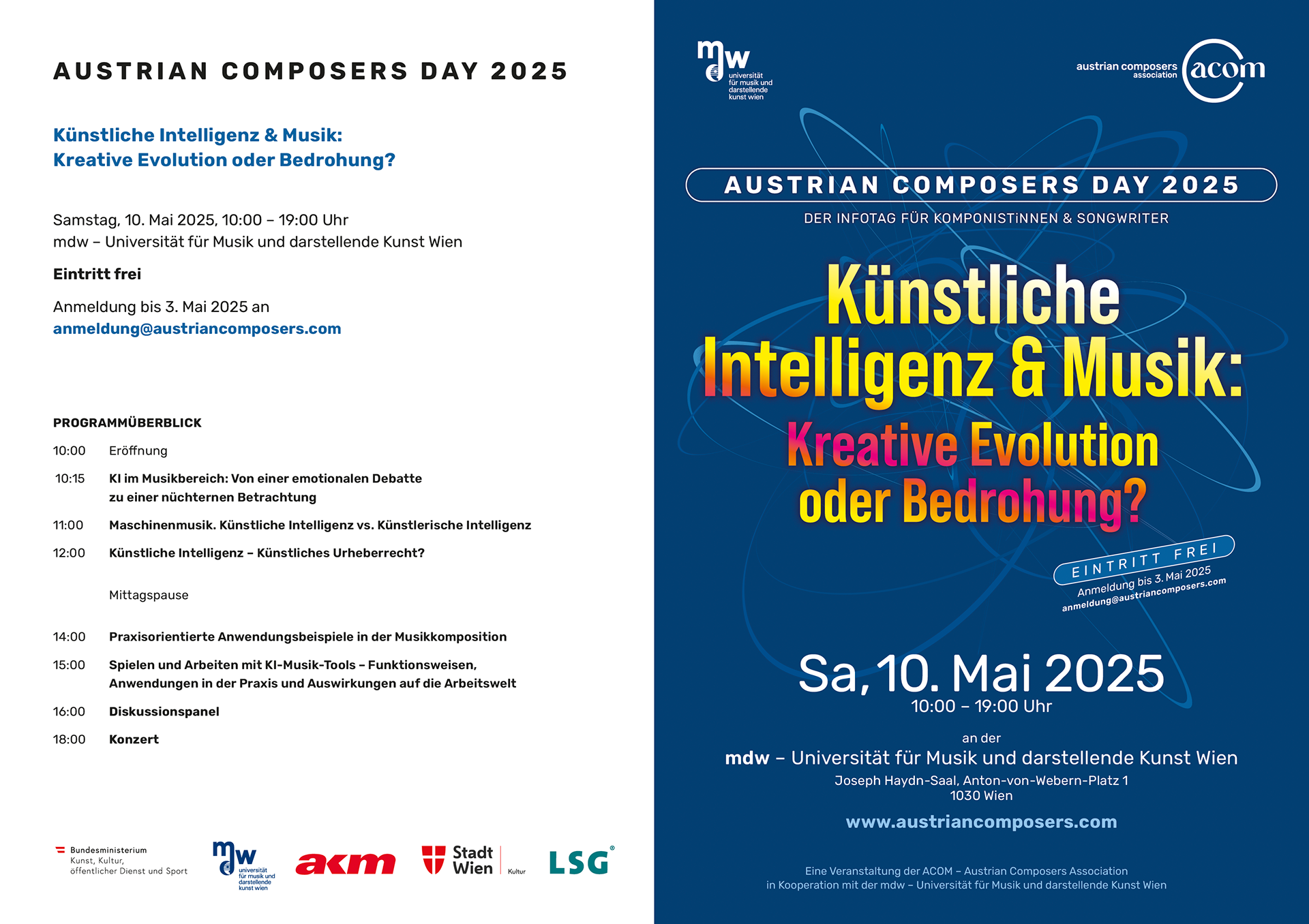
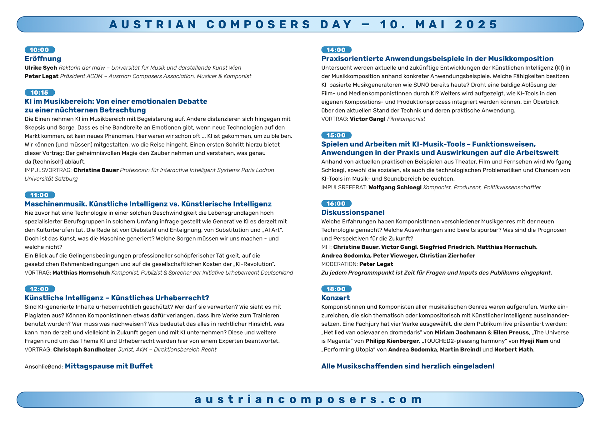
The Austrian Composers Association is a publicly funded organization that connects and supports local composers through events, workshops, and seminars.
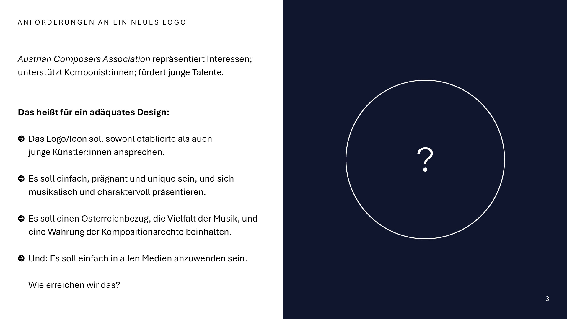
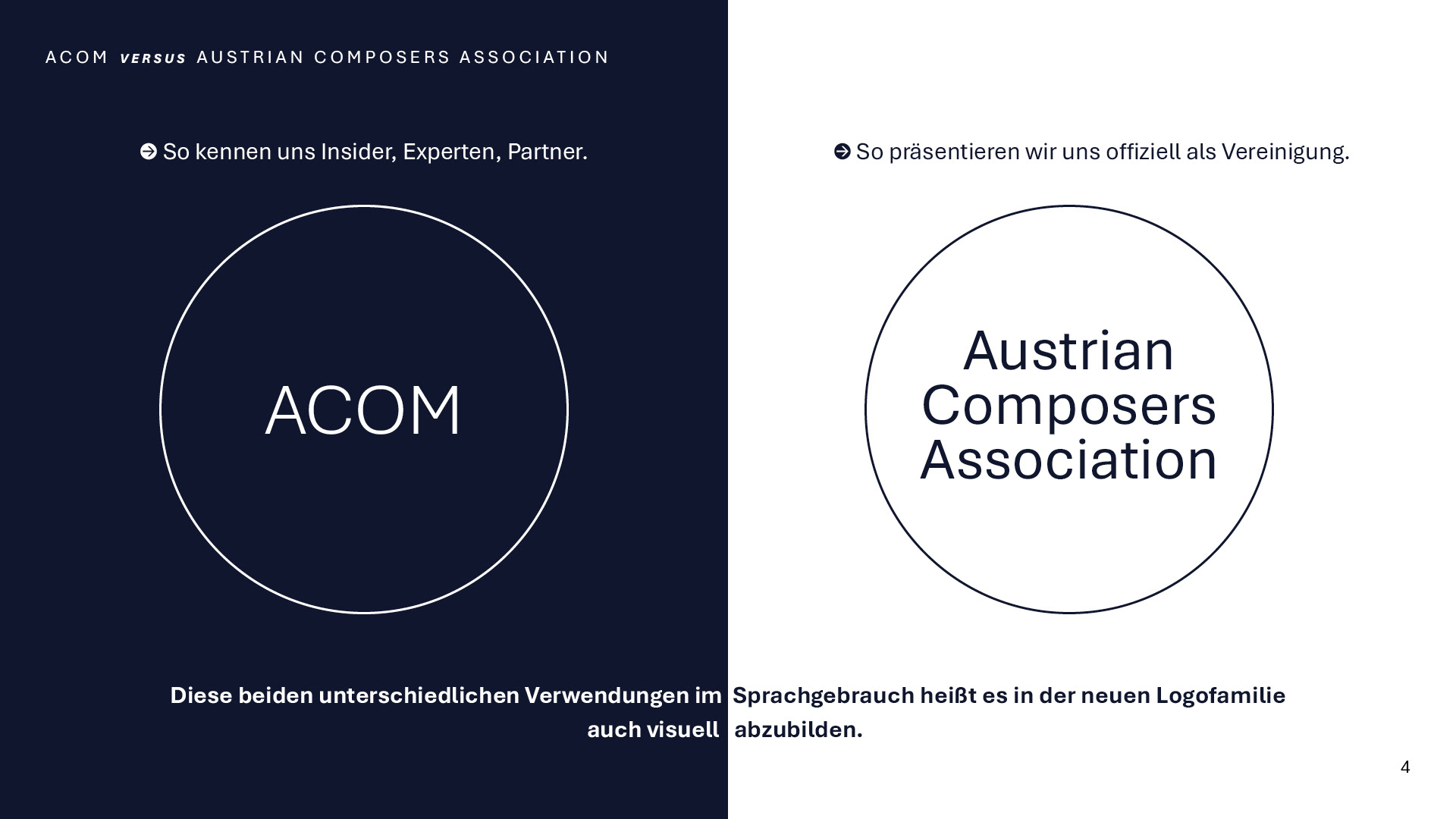
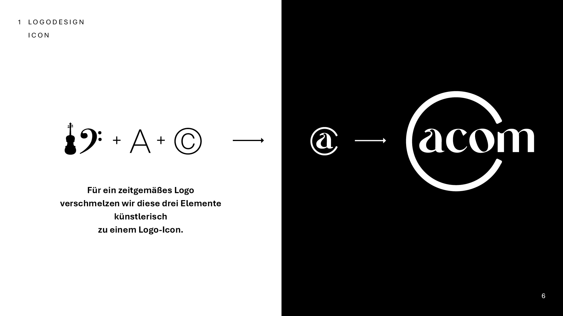
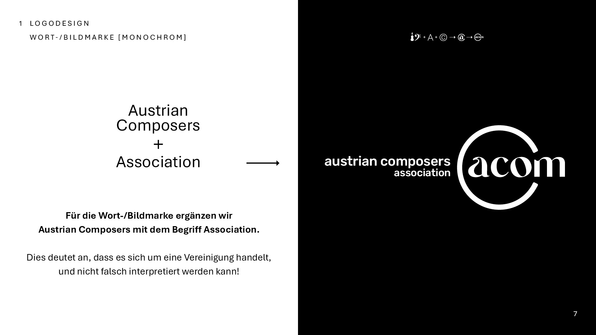
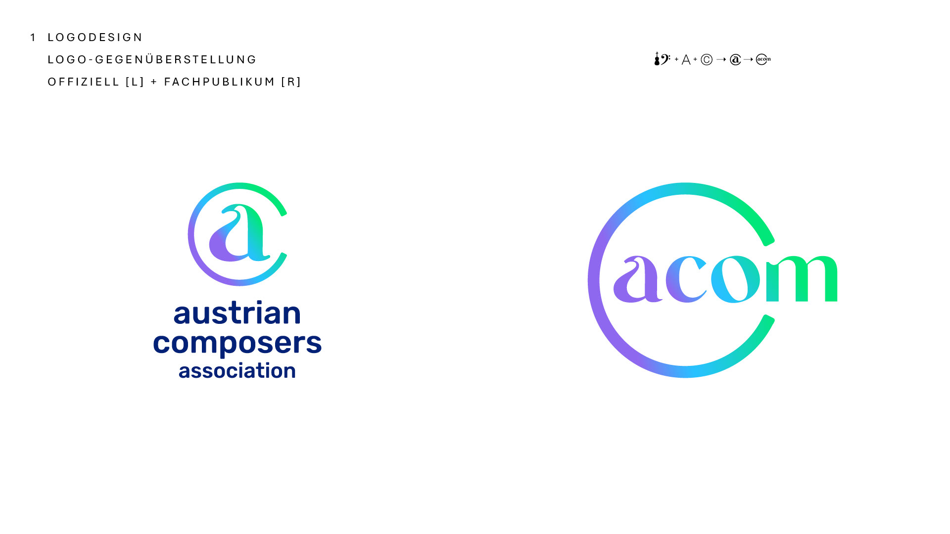
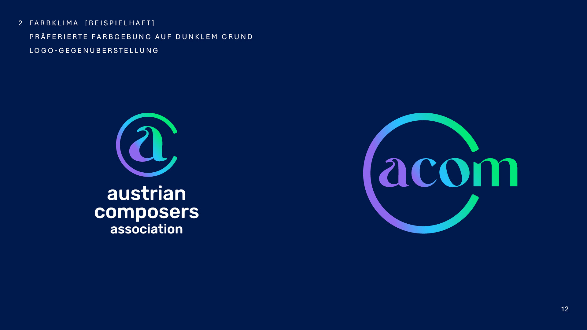
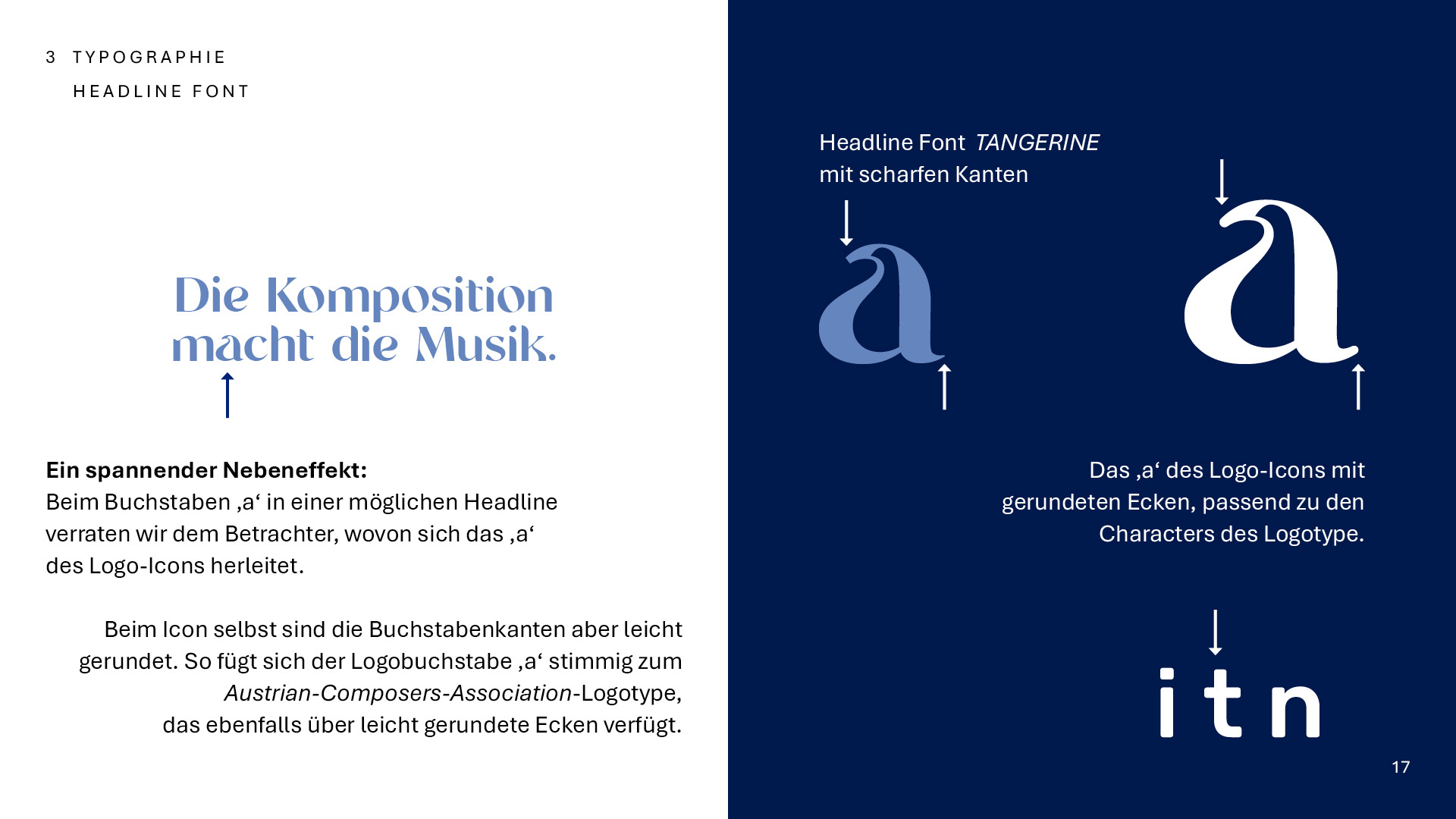
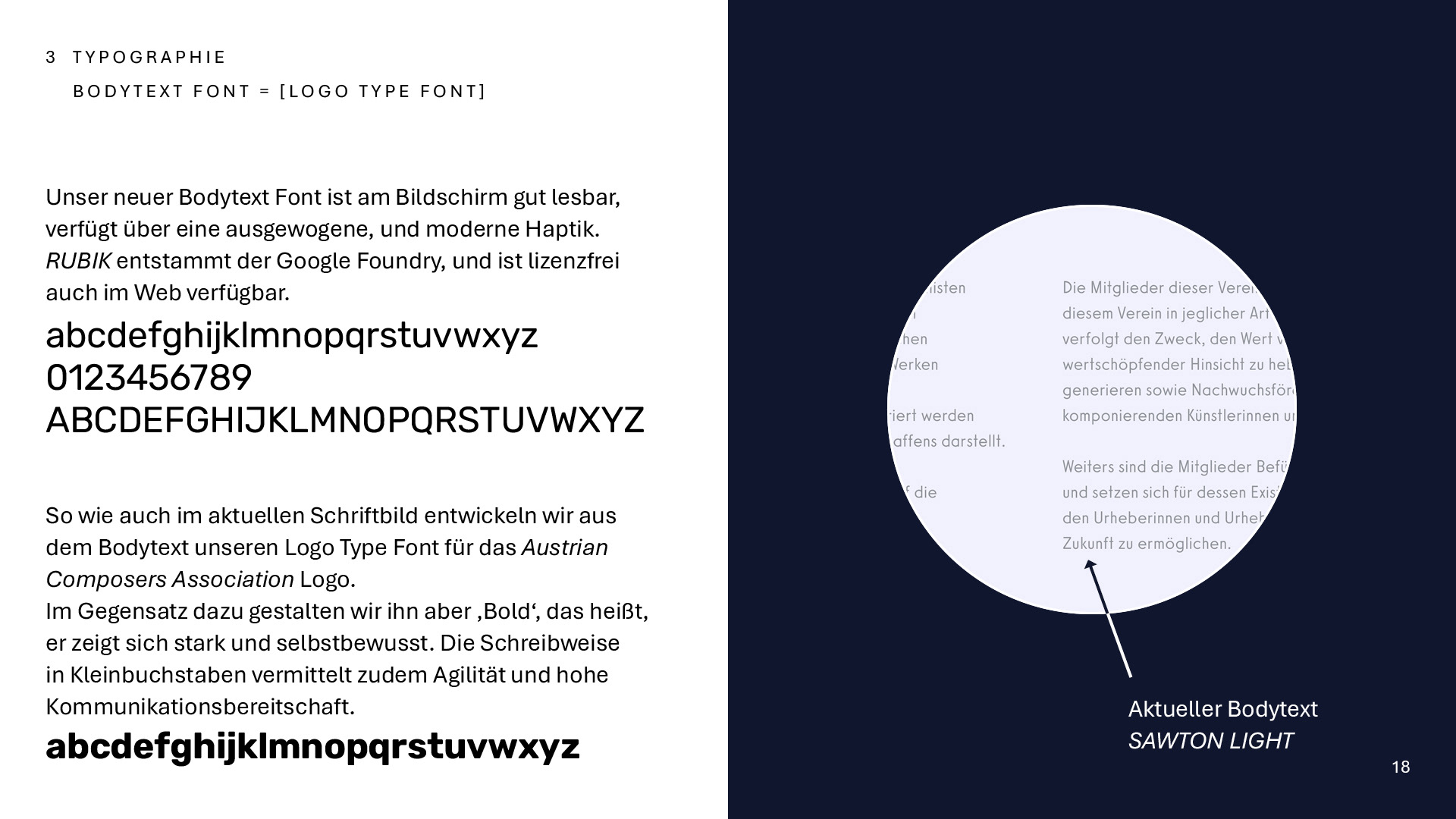
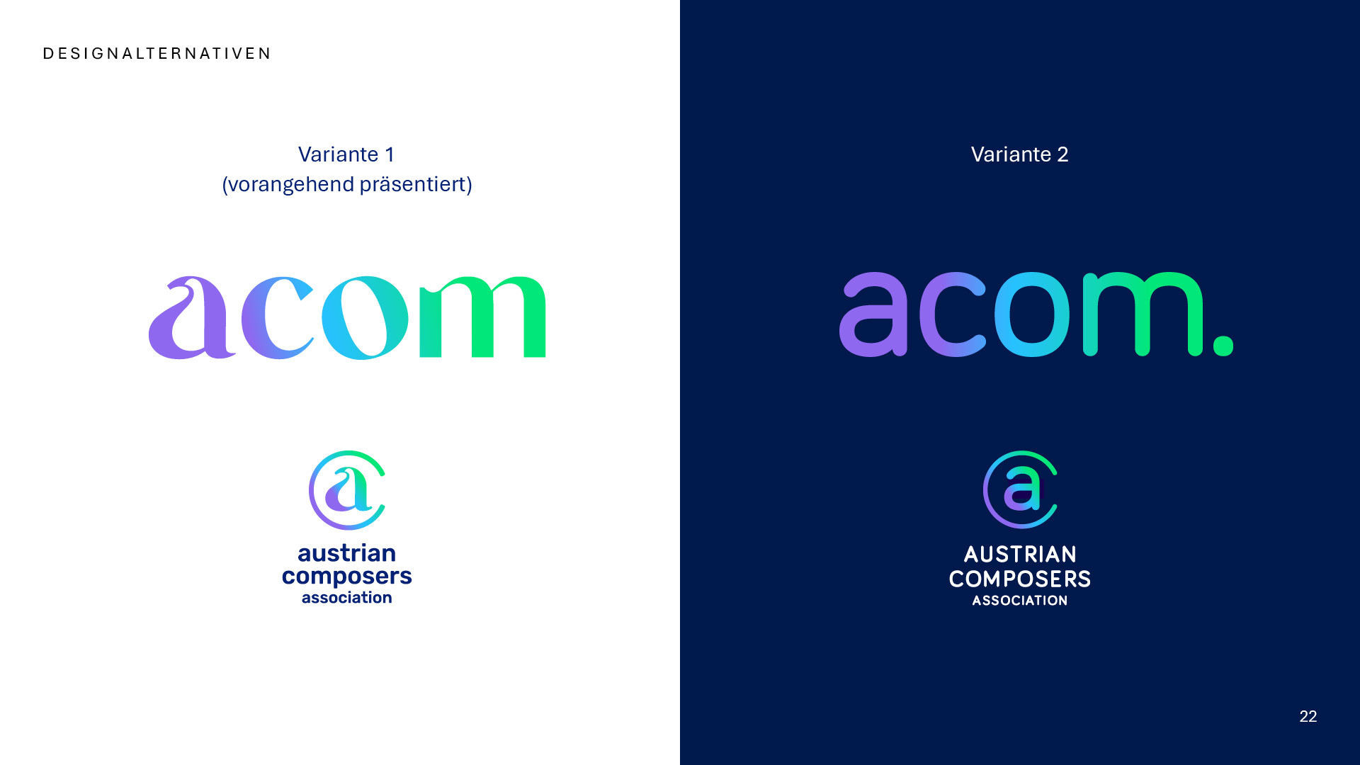
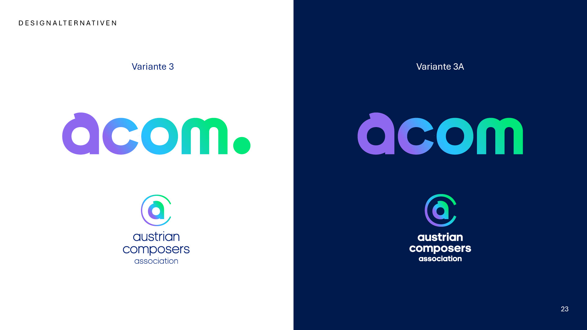
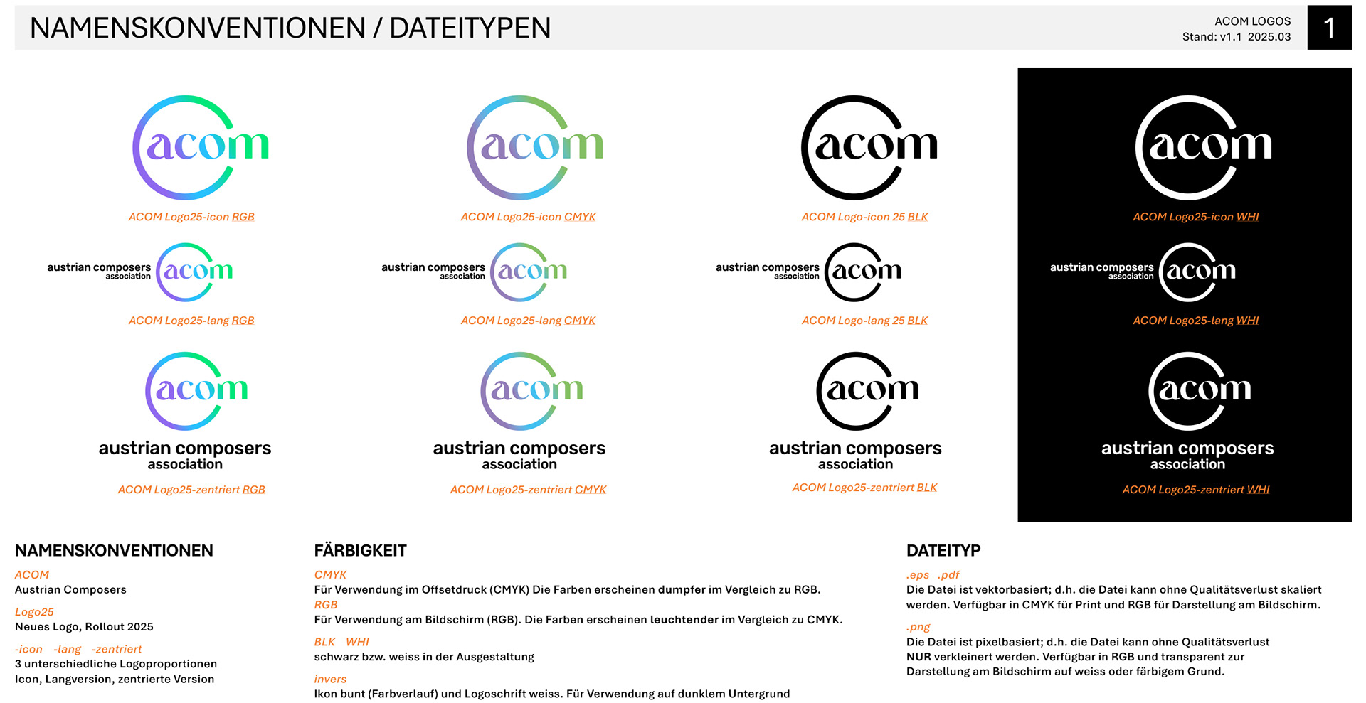
I was invited to present a redesign concept for their visual identity. The initial presentation — shown here in 24 slides — was already very close to the final version that was later implemented. During the presentation to the board, it became clear that the “acom” ‘a’ should play a more subtle role, while the wordmark ACOM should take center stage, as this abbreviation is the primary term used and recognized within the community. Additionally, the board requested a small adjustment to the upper curve of the letter ‘a’. You can scroll down to compare this initial proposal with the final version.
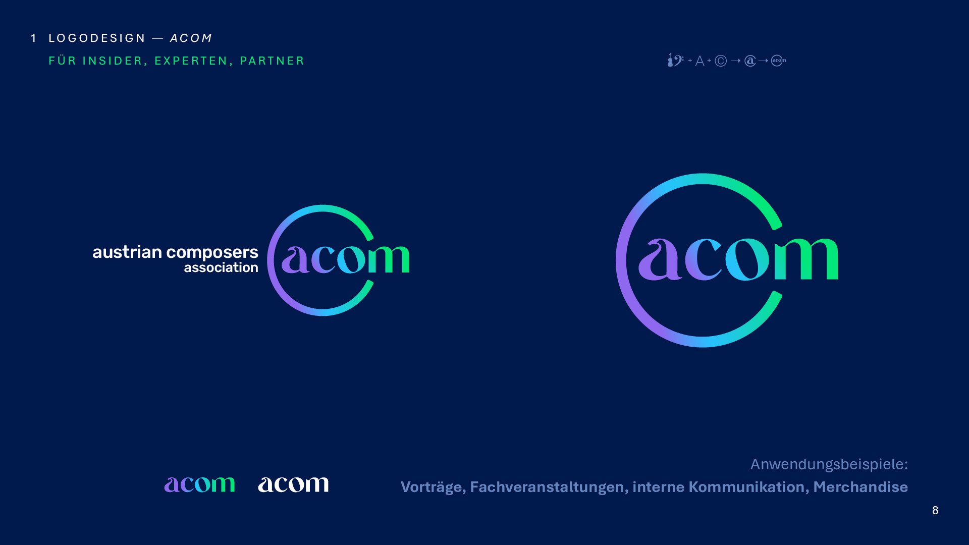
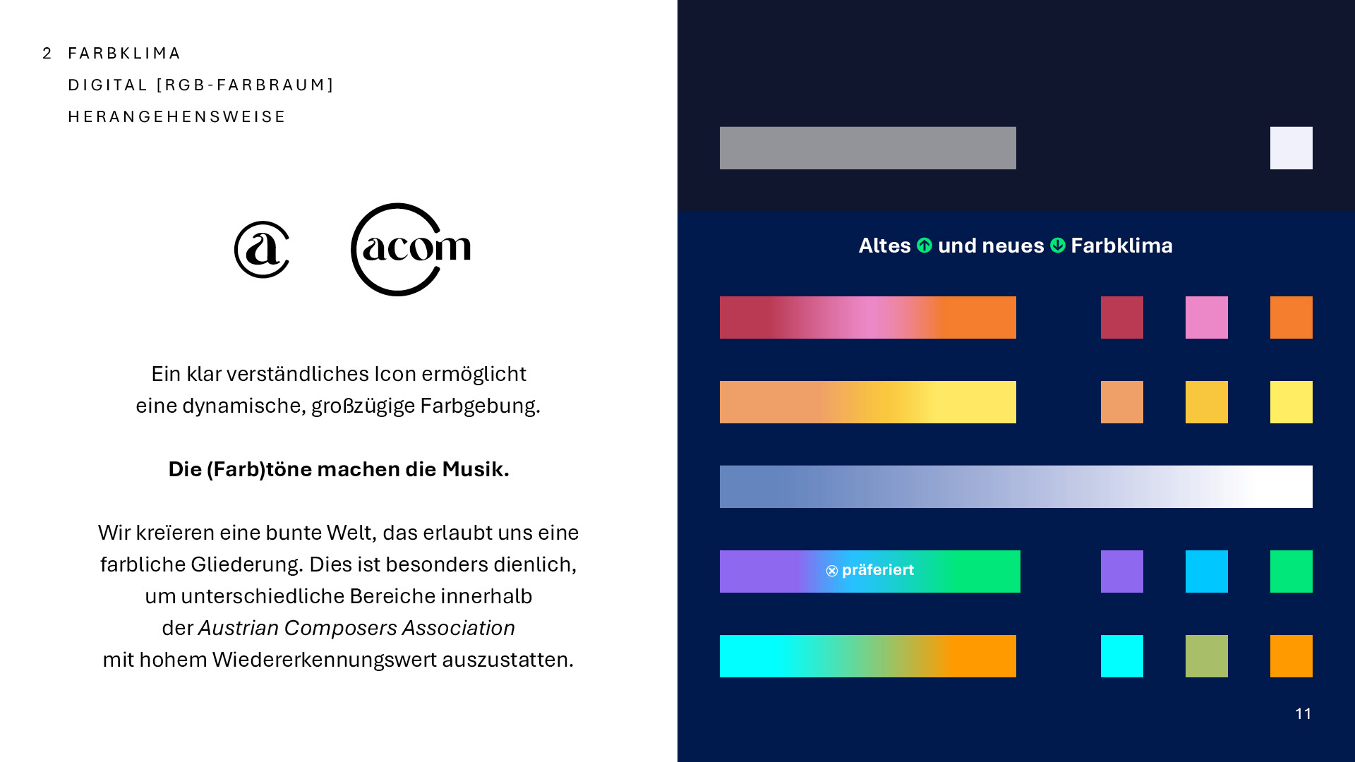
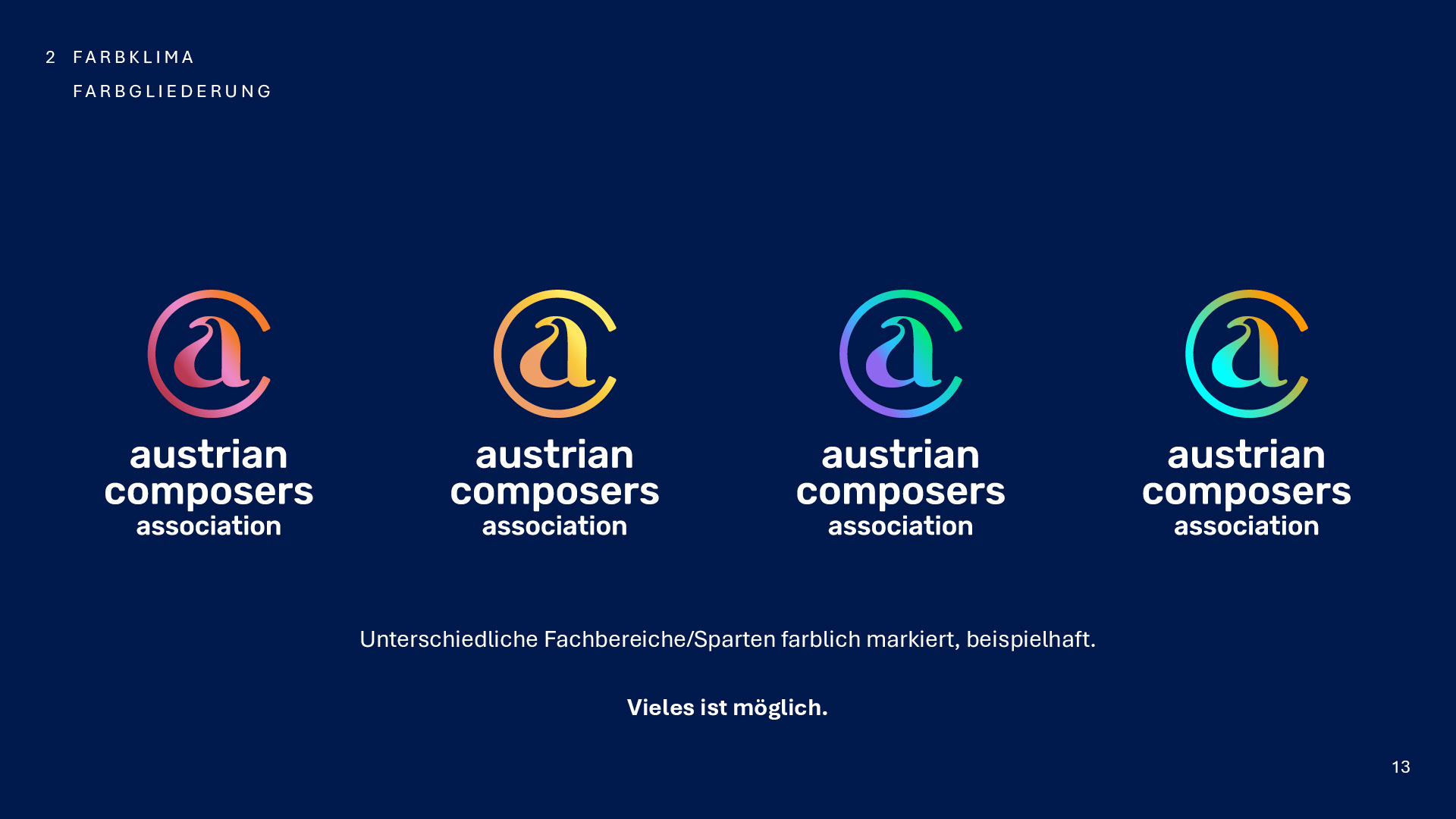
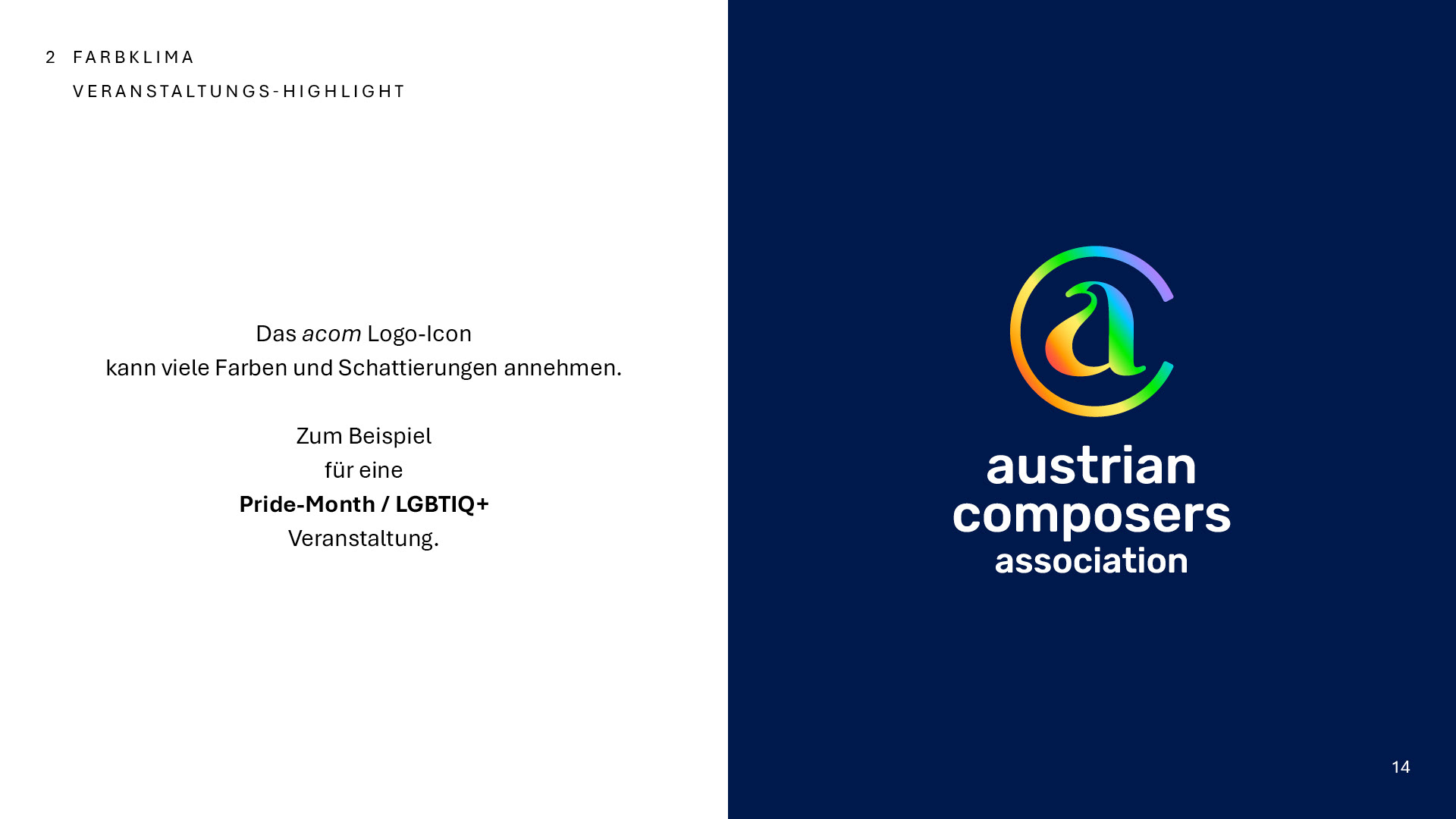
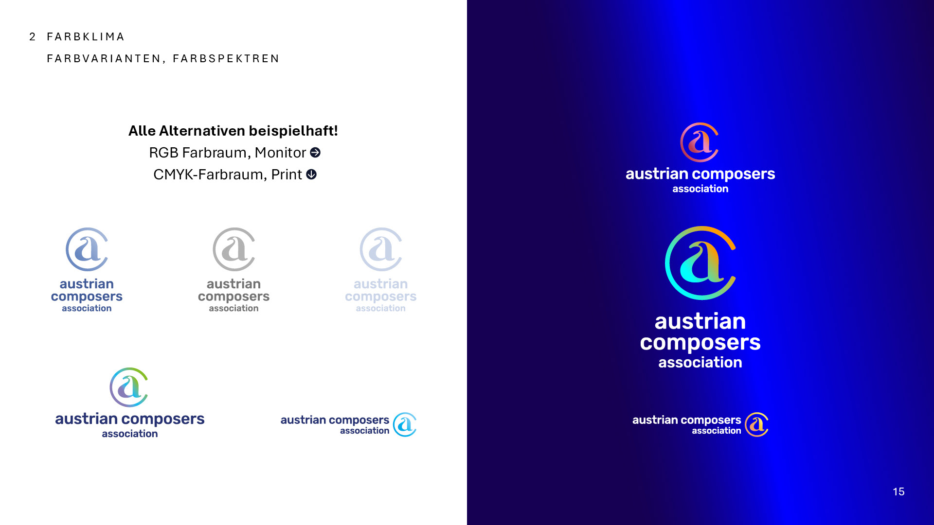
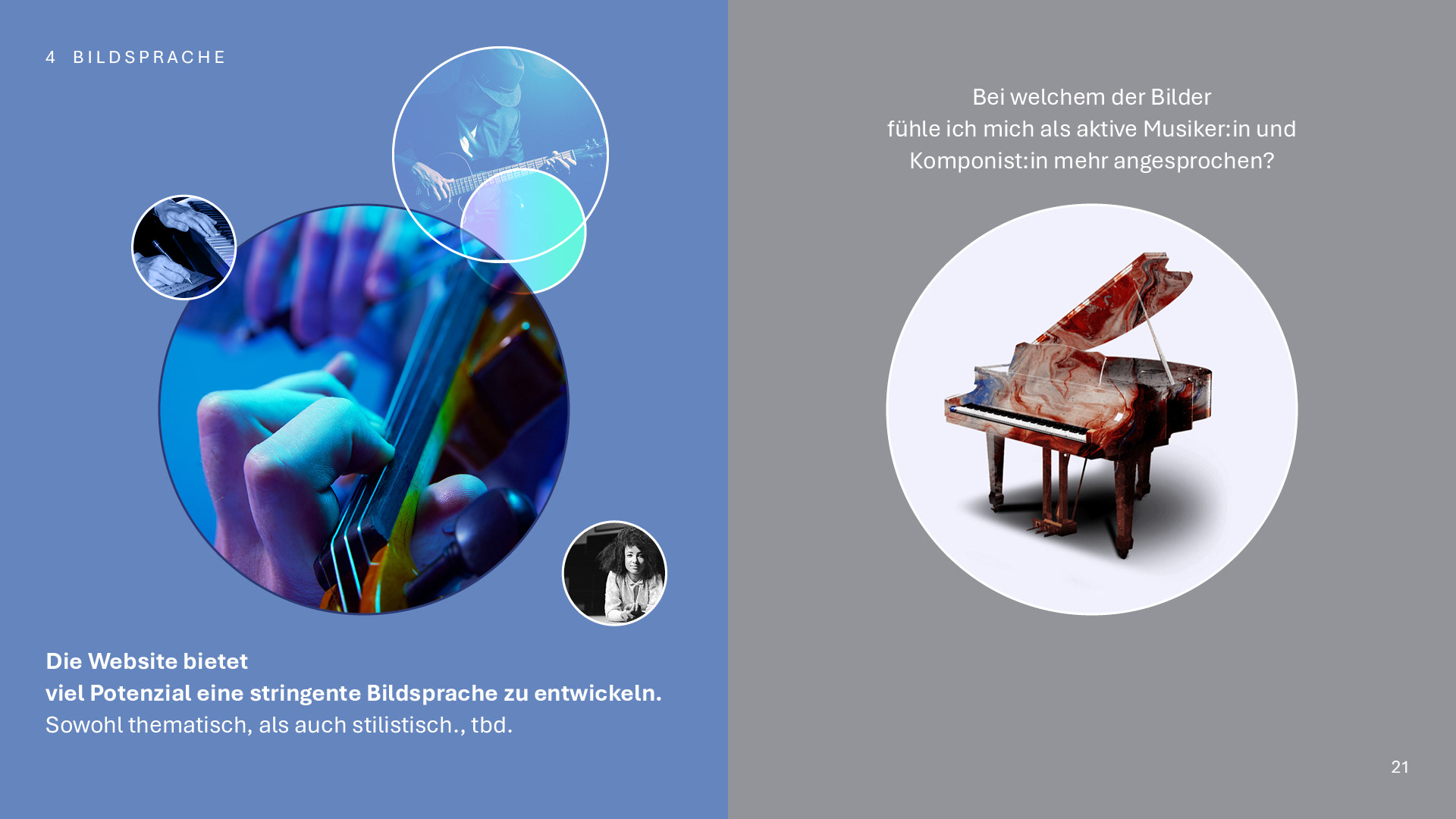
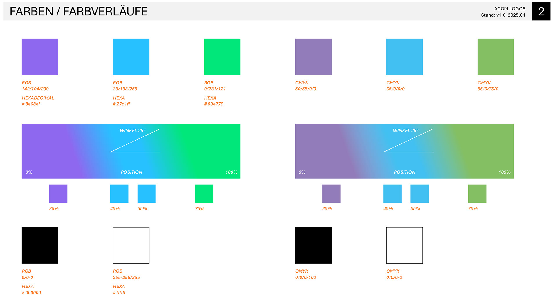
The color concept is also still in development. There is an ongoing exploration of broader color variations to better distinguish between different musical genres.
This project illustrates how design is an evolving process — one that remains in motion and continually responds to dynamic and spontaneous influences.
Redesign
Logo Presentation
Graphic Development
(2024 – today)
Logo Presentation
Graphic Development
(2024 – today)