Rarely working starts from scratch. You cannot distinguish a product or a company, just by re-designing a new logo or giving them a new brand-identity. You cannot ignore the path of history!
Sometimes it takes much, sometimes you need to change only details. But always keep in mind, what you do should stay for a while. So take care of time-stamping effects...

MQ-DAILY is a tiny but charming restaurant in Vienna’s Museum Quartier, serving daily changing menu’s. The old logo characters are being ruffled up a bit and the menu card has gotten already a bit long in the tooth. Carefully I redesigned logo and all printed matters. While keeping the italic touch of the logo I gave the logo-lettering a more stable ground. The current logo-type looks more homogenous and not so contrived anymore.
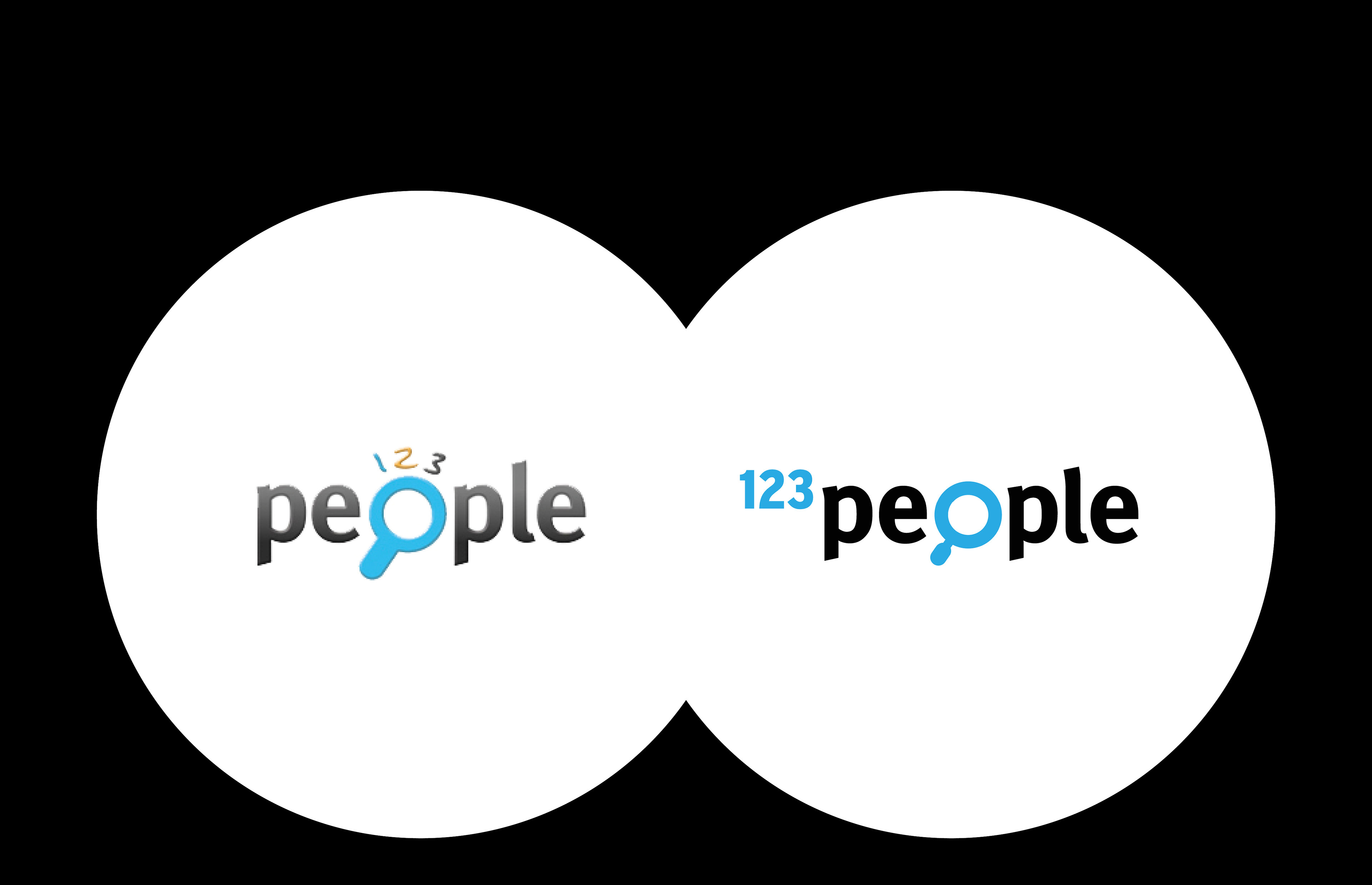
Google was not always that big. Years ago other search-engines existed besides a rapidly growing google-search. 123PEOPLE was a successful online-engine, specialiced on giving infos related on persons in the internet. Their first logo was a pick'n'mix creation. At it’s peak 123people aspired a successful exit. The company’s value should also sparkle in the logo! I was in charge to realize this extremely sophisticated project. I did it. 123people was sold to the biggest french telephone company ... and it worked!

Also small companies deserve best support, even when it takes little changes only. Getting rid of the pretty ugly 3D-lettering, giving the swoosh a firm grip and putting a new 'more active' tag line to the logo. Done!


